Goals & Context
This project began as a 5-day design sprint to quickly
explore the UX challenges of fleet management software in the
mobility industry. What started as a rapid prototype exercise has
evolved into an angoing case study-expanding with usability
testing, field observation, and real-world workflow analysis.
My goal is to
master complex operational UX and decision-support interfaces
while building a deeper understanding of the environment, stressors,
and information needs of fleet managers and drivers.
Design Process & Non-Linear Workflow
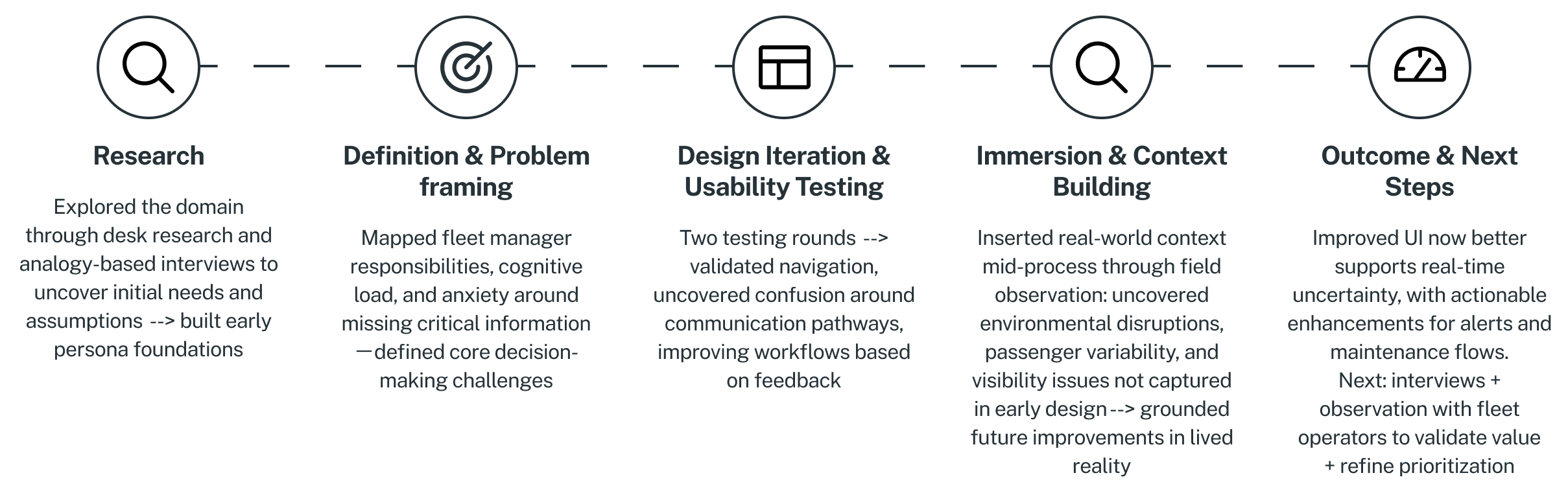
Instead of waiting for a “perfect” solution, i prioritized fast learning and continuous iteration. I built an early prototype based on primary research insights, user needs and pain point definitions, to validate assumptions quickly, then blended usability testing with field observation and journey mapping between iterations. This non-linear loop-cycling between understanding, designing, and validating-helped ensure every design decision stayed grounded in real operational challenges and not just theoretical workflows.
Hypotheses
At an operational level, in e.g. public transportation, fleet managers a required to efficiently manage bus fleets, ensure compliance and enhance passengers safety. Dealing with various issues (safety, compliance, efficiency) might lead them to information overload.
Fleet managers might be overloaded with information of different sorts and therefore need an interface that provide information "at a glance", to help to operate with ease.
Research & Insights
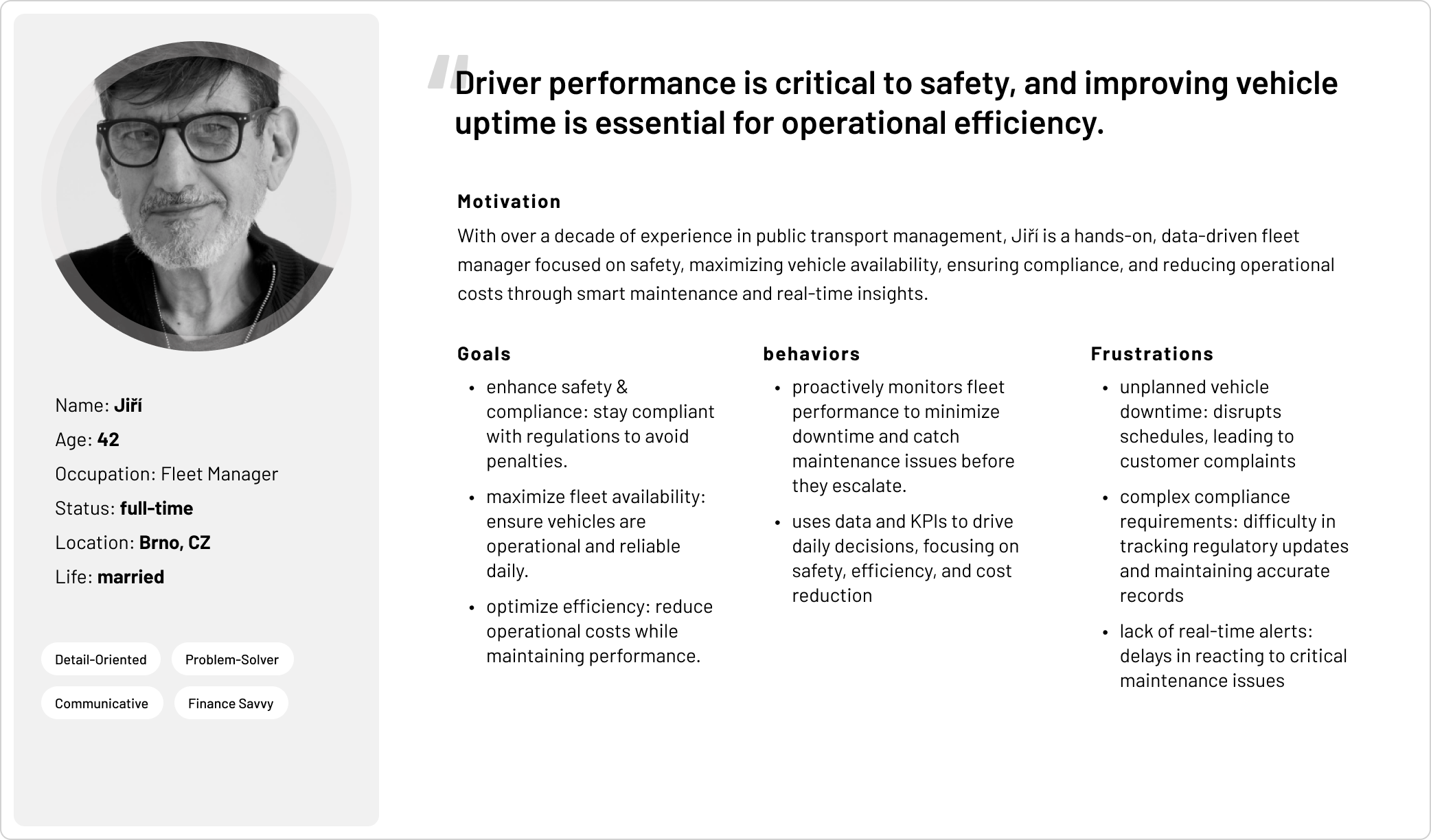
What real operations signals do fleet managers prioritize? And where can the dashboard better support decision urgency? Through generative research, I gained early insights that informed a persona, clarifying both the fleet manager’s responsibilities and the decision-making challenges they face daily, as outlined below.
Fleet Manager Role:
Fleet managers typically hold
mid-level operational positions, focusing on the hands-on
management of daily fleet activities. They prioritize
efficiency, safety, and cost control rather than strategic
decision-making. Key responsibilities include:
- Monitoring fleet performance (availability, fuel efficiency, maintenance needs)
- Ensuring vehicle safety and compliance
- Coordinating with drivers and maintenance teams
- Responding to operational alerts (vehicle breakdowns, driver issues)
- Reporting to top management
Decision-Making Space:
The “decision-making space”
refers to the
cognitive environment in which fleet managers interpret
information and make operational choices. Fleet managers face multiple challenges daily—safety, compliance,
and efficiency—which can lead to information overload. They
must rapidly process inputs such as:
- Inputs: vehicle telemetry, driver reports, passenger feedback, maintenance alerts.
- Processing: filtering, prioritizing, and interpreting signals (what's noise vs. critical).
- Outputs: actions (reroute, schedule maintenance, assign a new driver, alert stakeholders).
Problem Framing
A fleet manager may feel anxious about missing critical information that could impact user safety—a “blind spot” where unknown issues might go unnoticed or have unforeseen consequences. The core challenge is providing access to the most critical data within a high-volume information environment, helping managers filter signals, distinguish noise from urgent alerts, and anticipate issues before they escalate.
Ideation & Prototyping
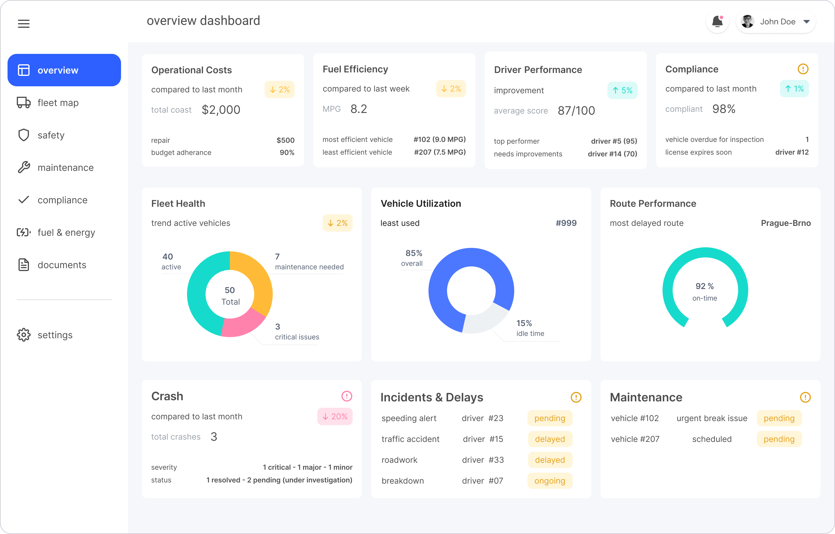
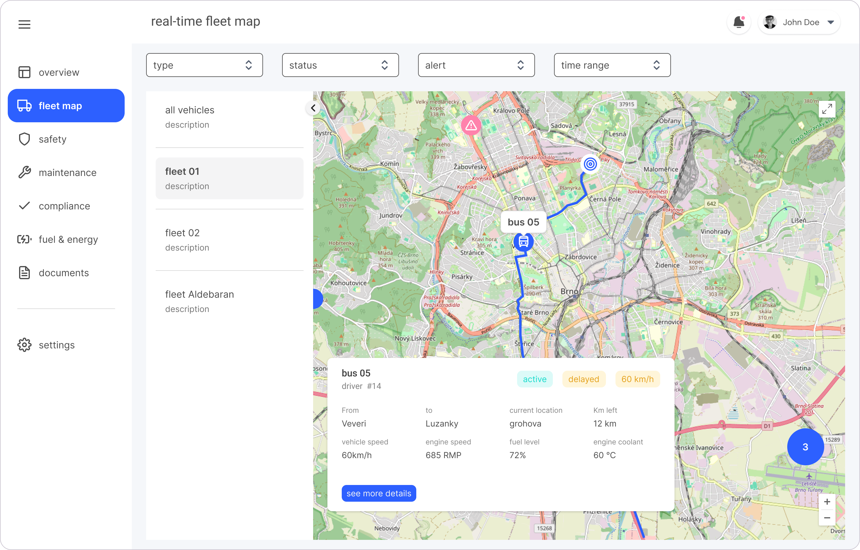
I first mapped the user flow to outline key tasks and visualize how screens and information would be structured, helping to guide the information architecture. Based on this, I created wireframes, mid-fidelity mockups, and a clickable prototype to test with users as early as possible.


Usability Testing & Insights
I conducted remote usability tests with clickable prototypes to evaluate user understanding of information, navigation flow and contact features. Key insights included:
- Tested comprehension of dashboard metrics (costs, crash rates)
- Assessed navigation preferences (cards vs side menu)
- Evaluated interaction with fleet map and live danger alerts
- Identified missing features: multiple contact methods and clearer alert visuals

Iteration & Validation
The second usability test confirmed improved metric comprehension and map interaction but revealed continued navigation ambiguities and contact access issues, guiding further refinements.
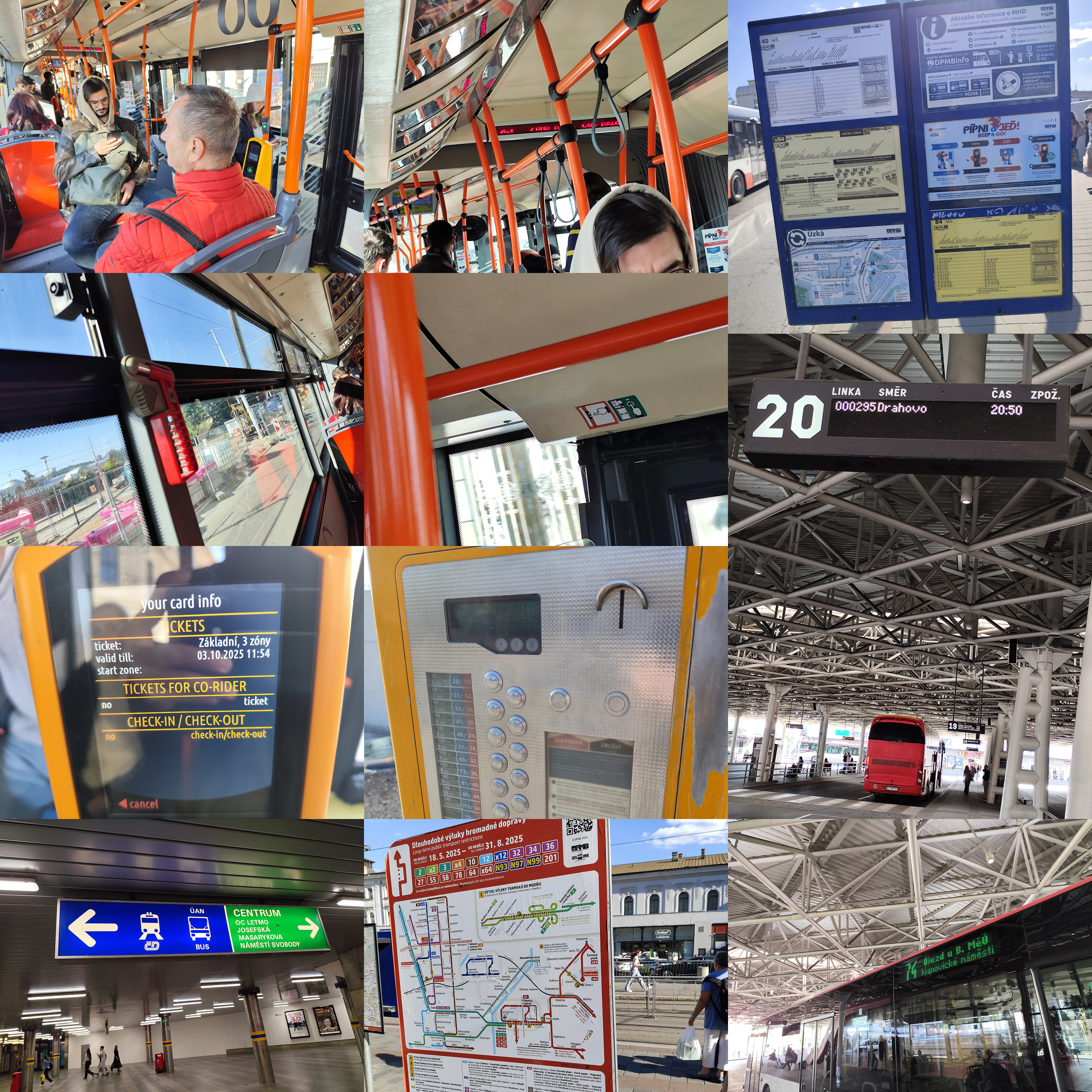
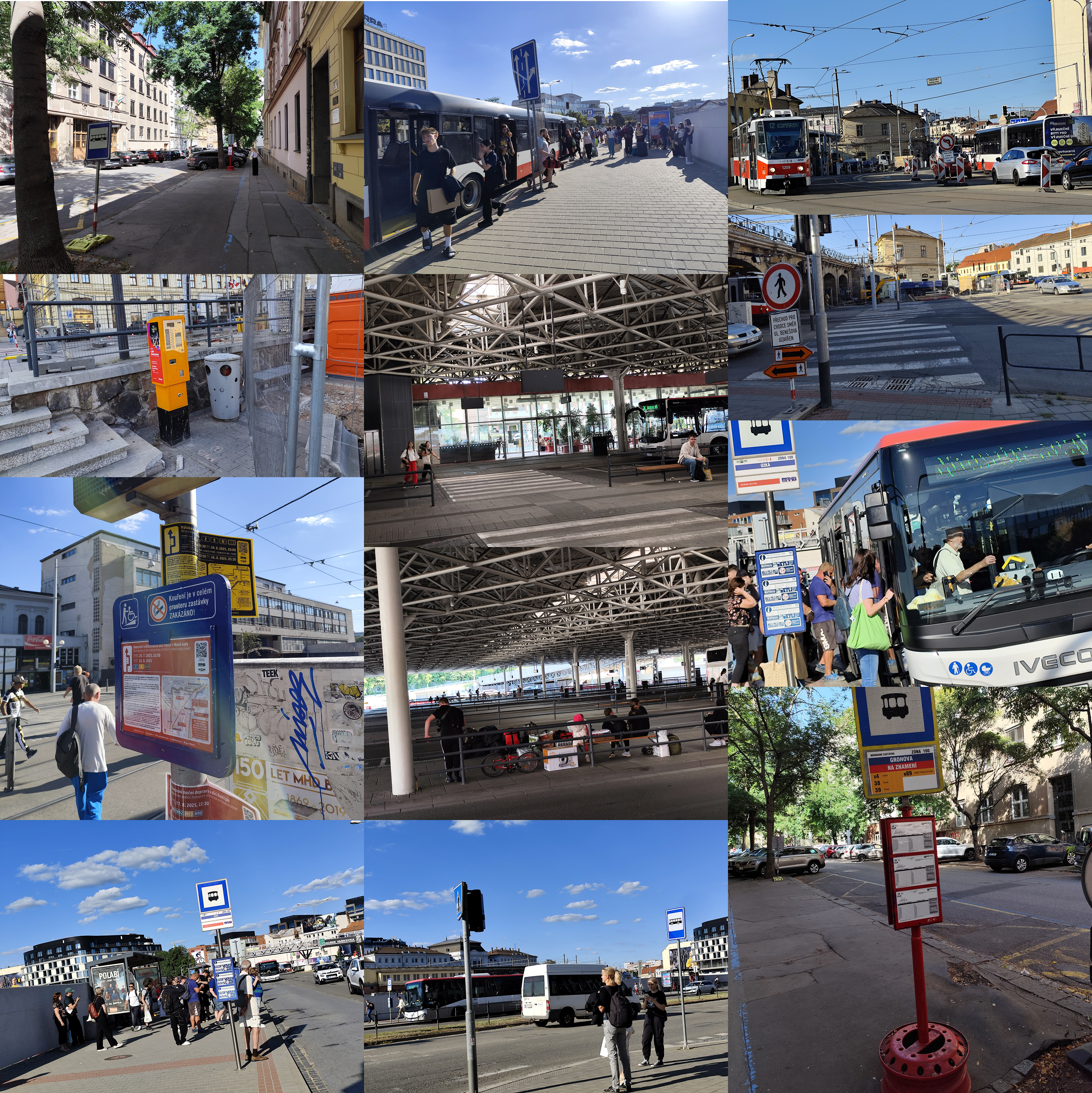
Immersion: Field Reality + Context Building
Running field immersion between design iterations ensured my next decisions were grounded in real operational challenges-especially around uncertainty and environmental disruptions
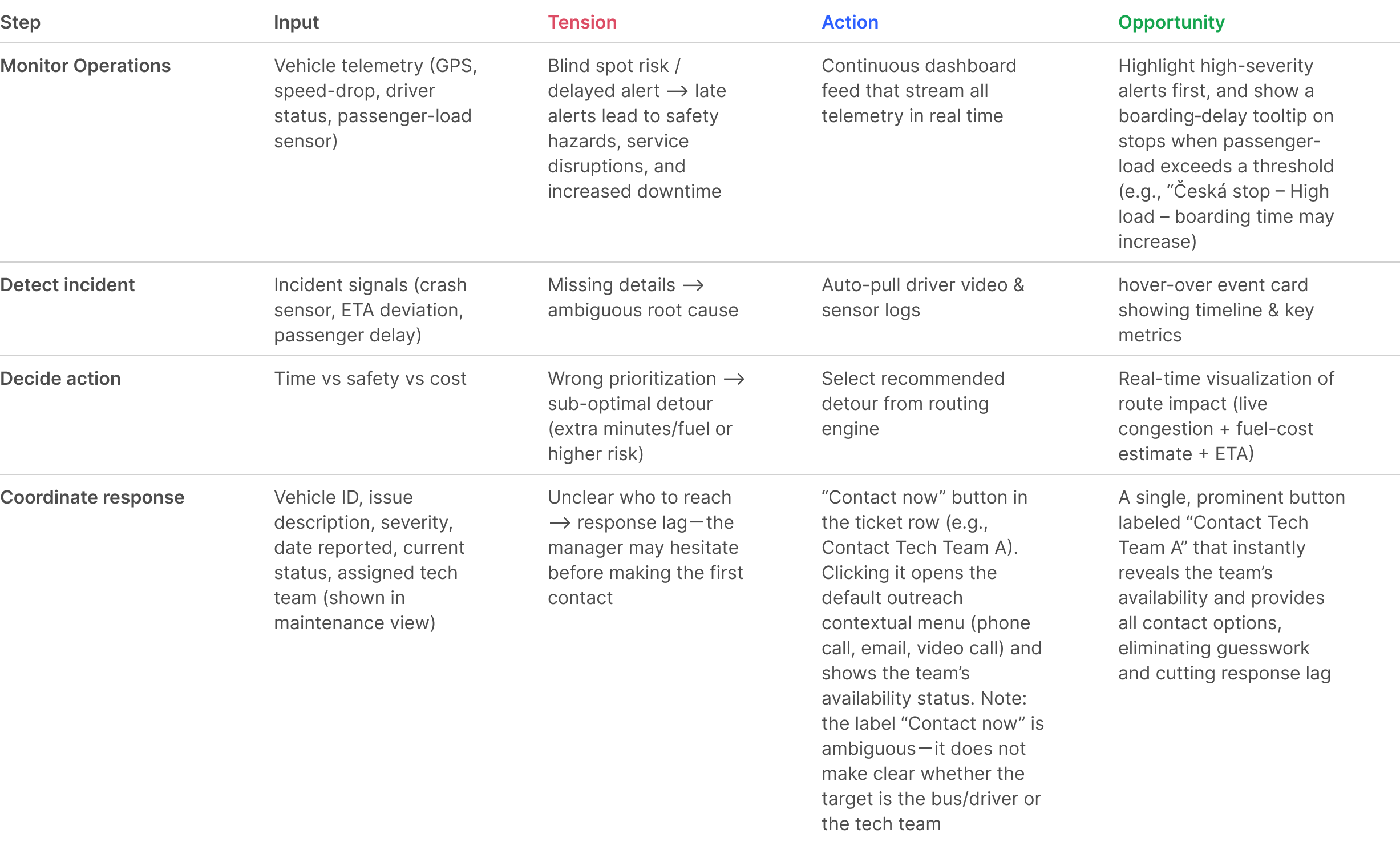
Journey Map
A journey map created after field study to reflect real operational reality, not theoretical workflow assumptions, following a fleet manager workflow: continuous monitoring --> incident detection --> decision making --> coordinated response, mirroring how the operation runs in practice.
Outcome
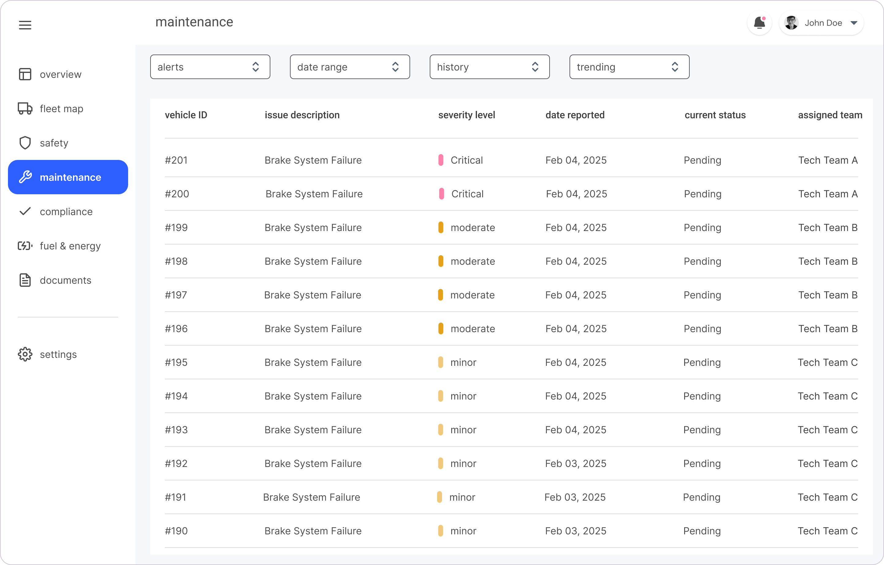
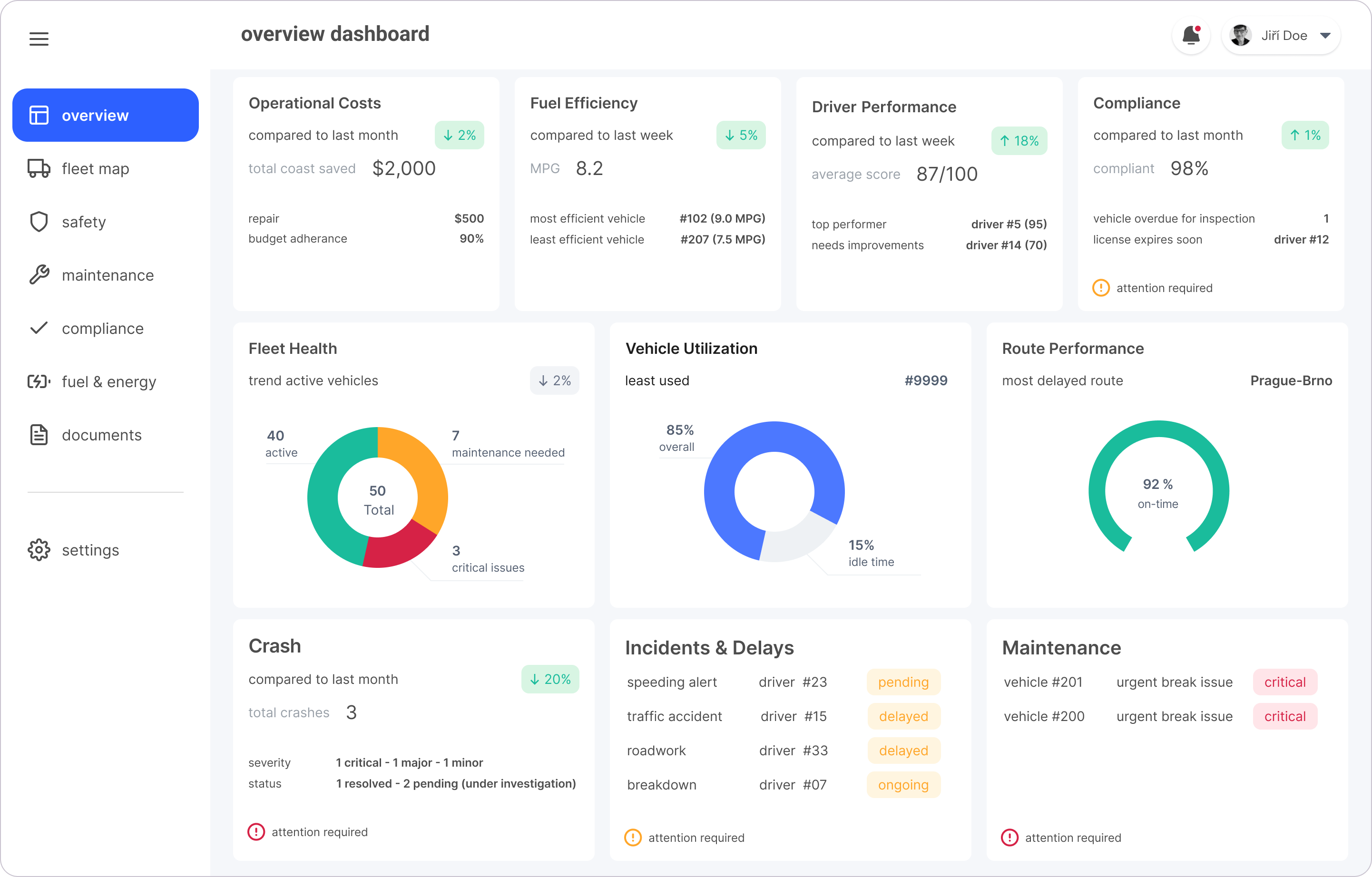
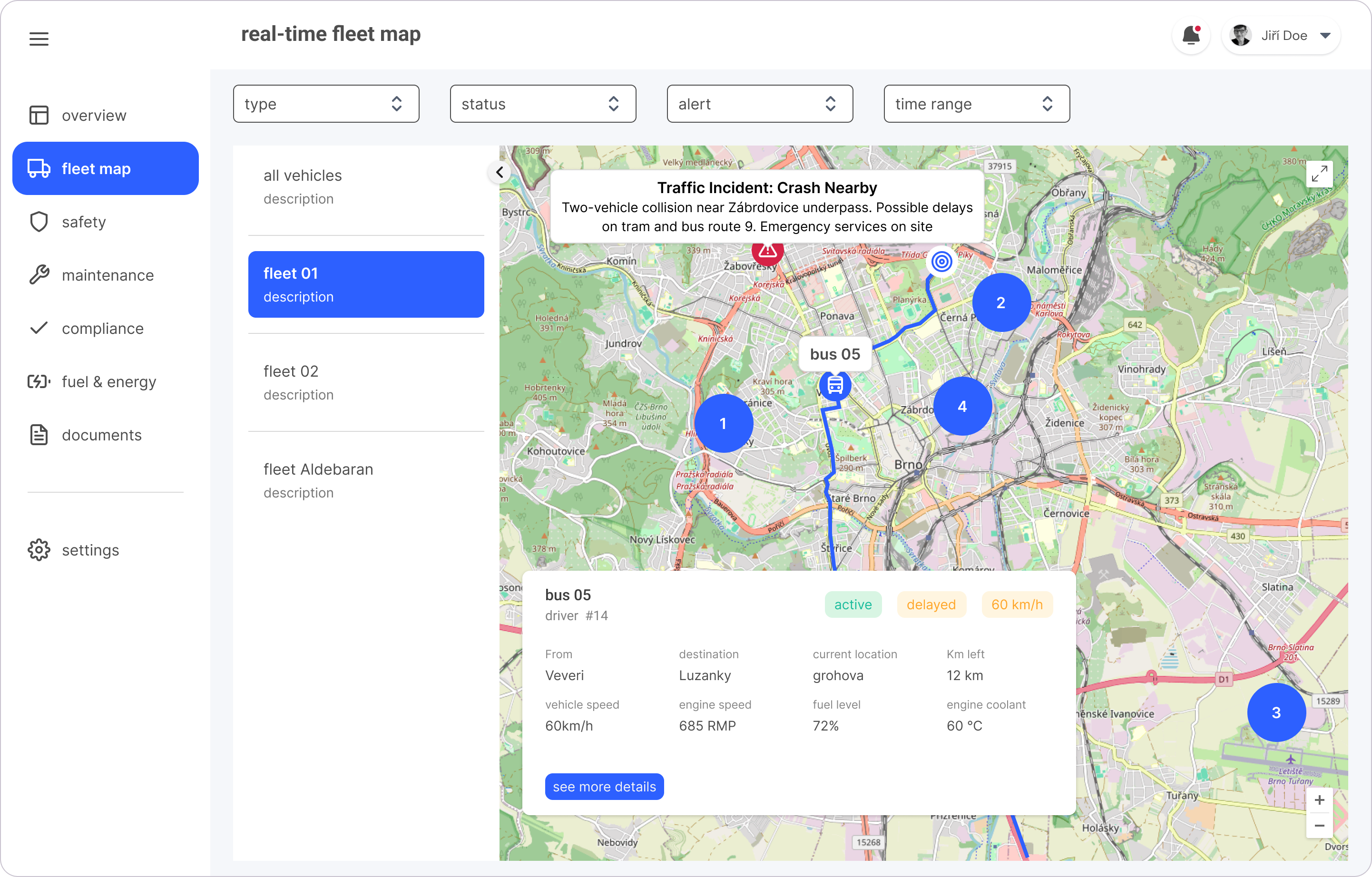
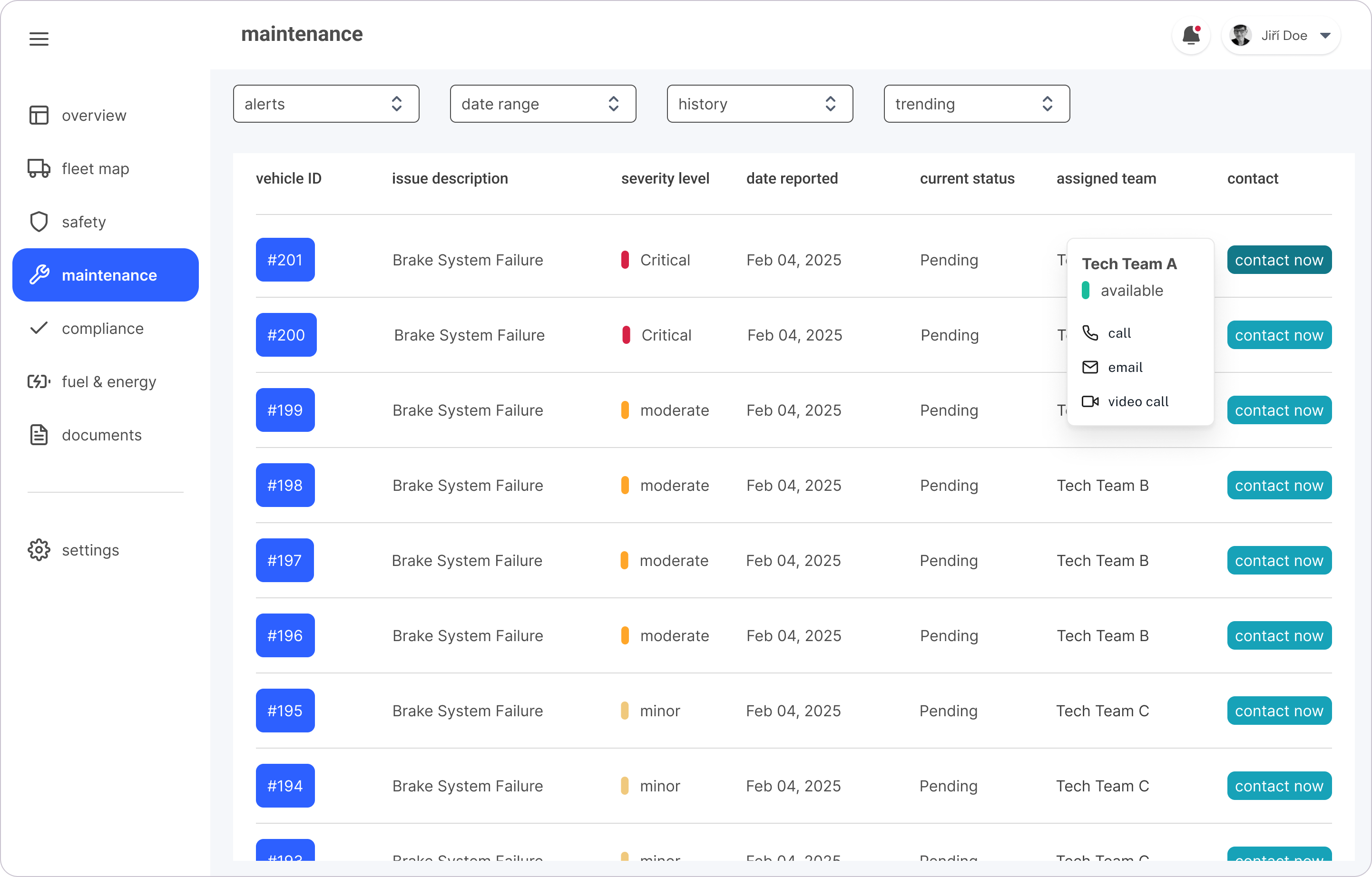
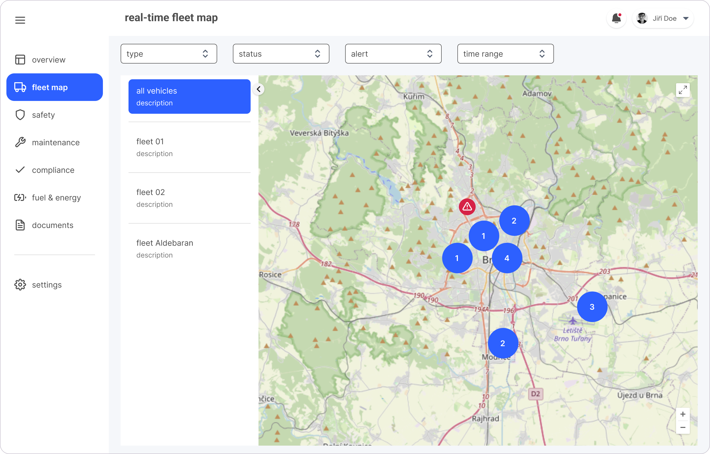
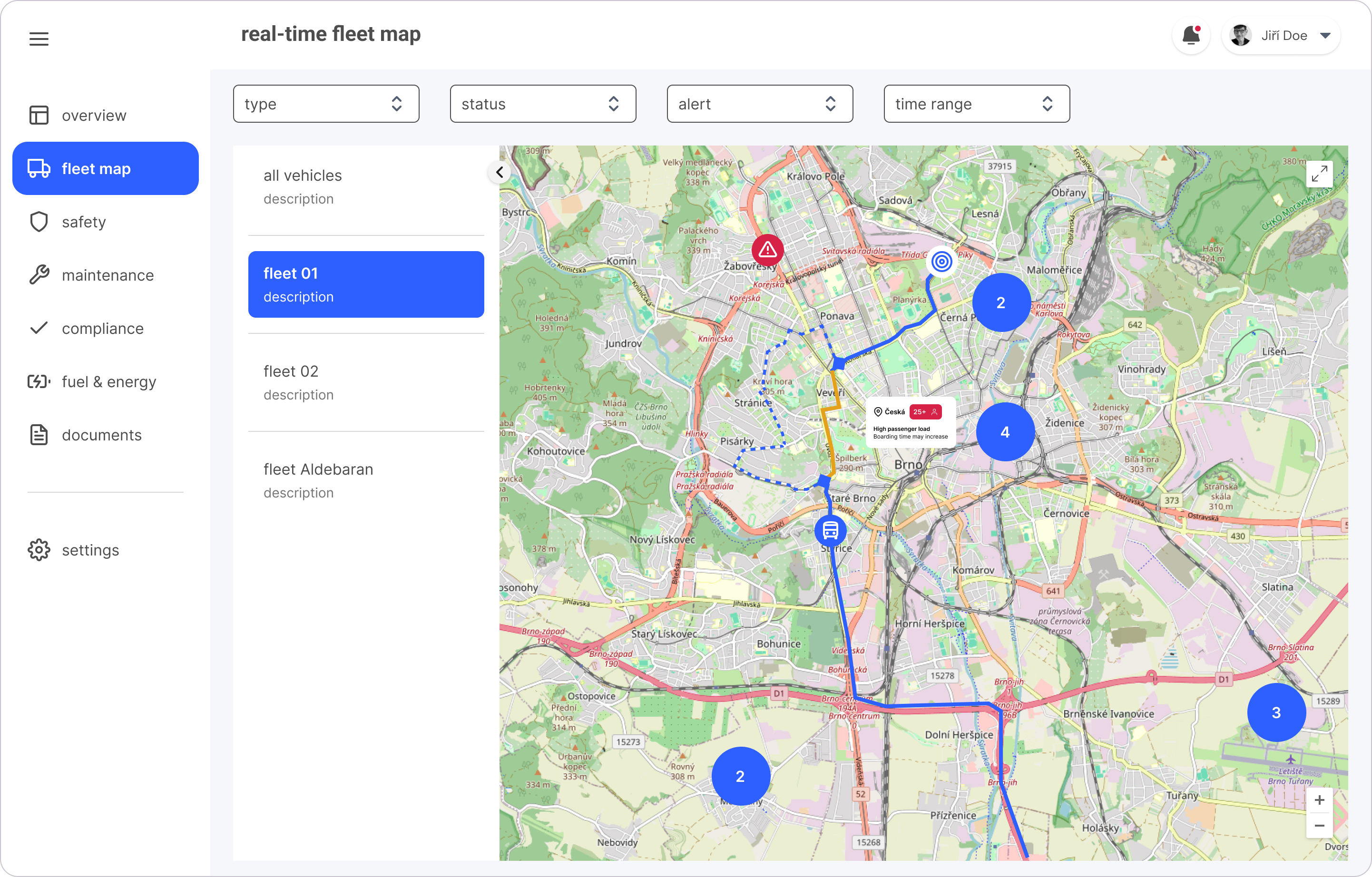
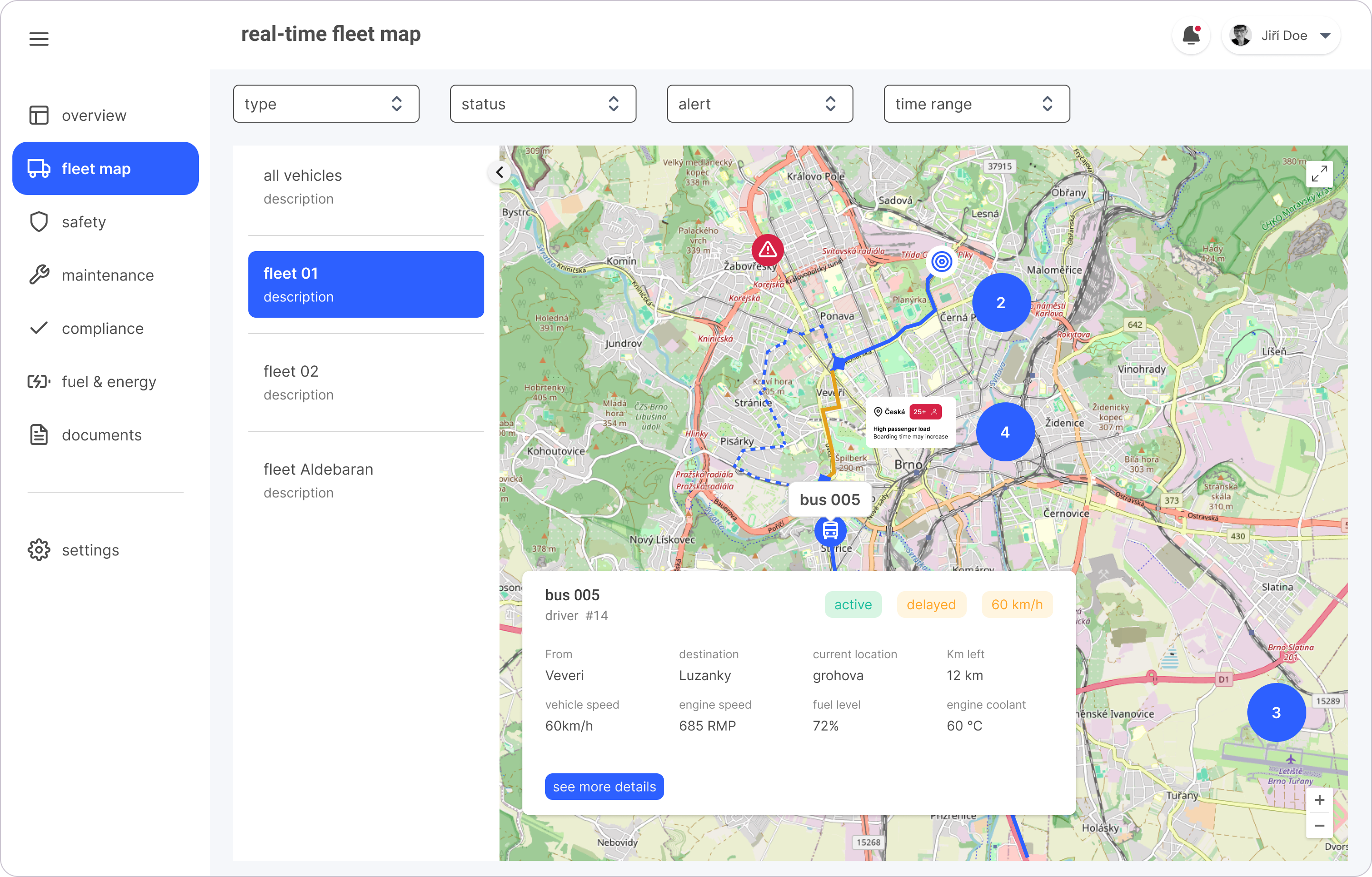
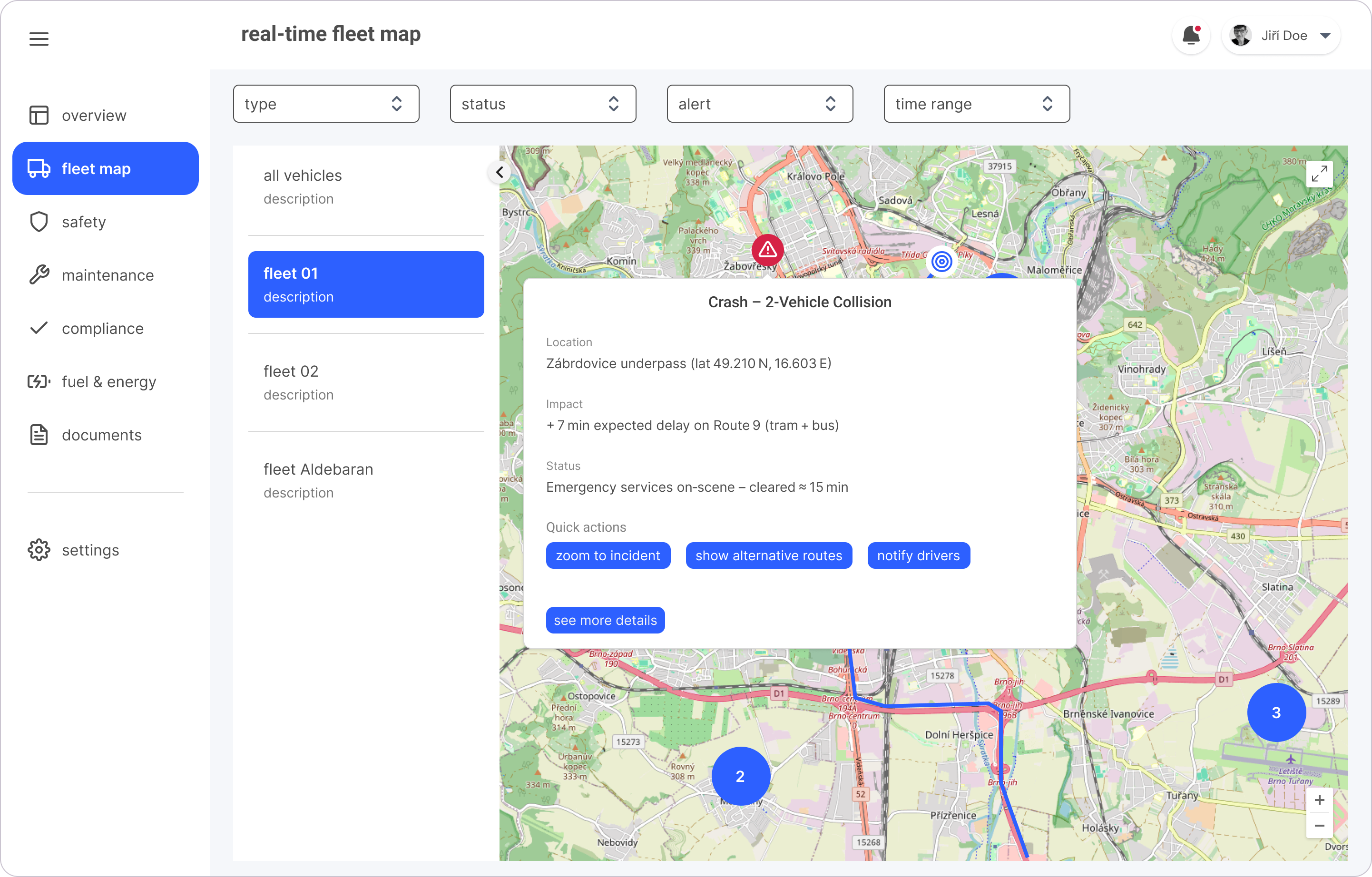
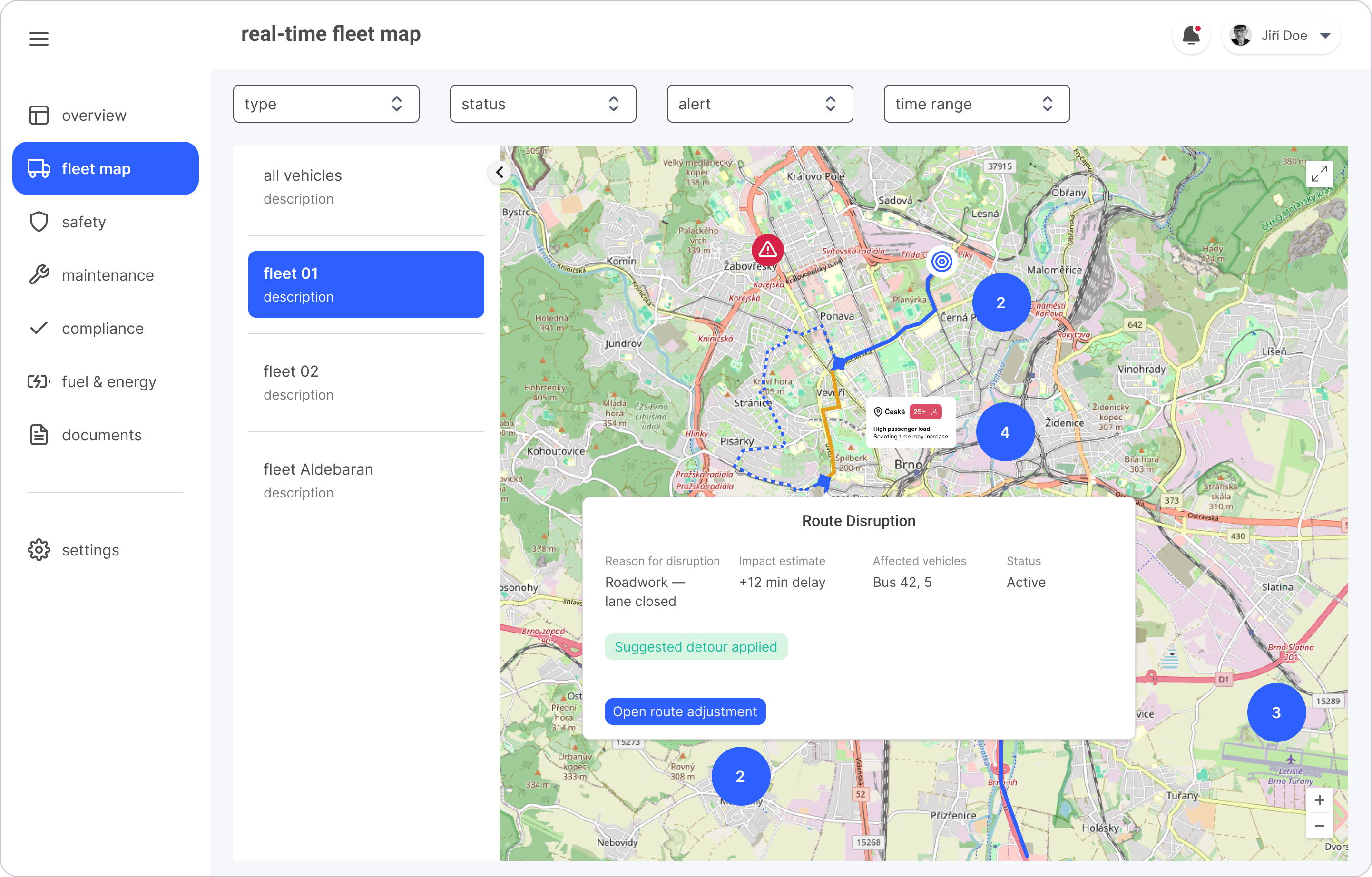
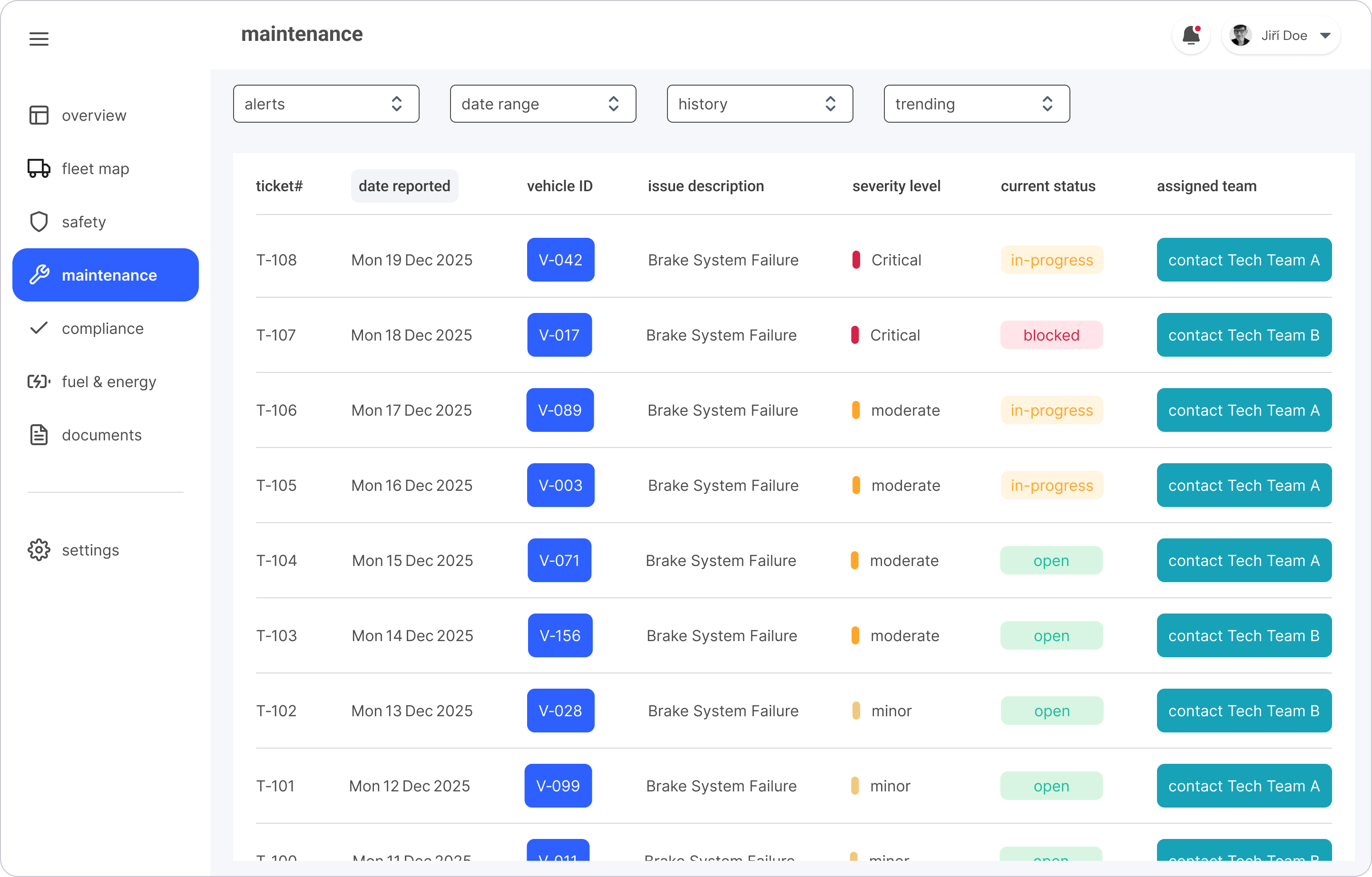
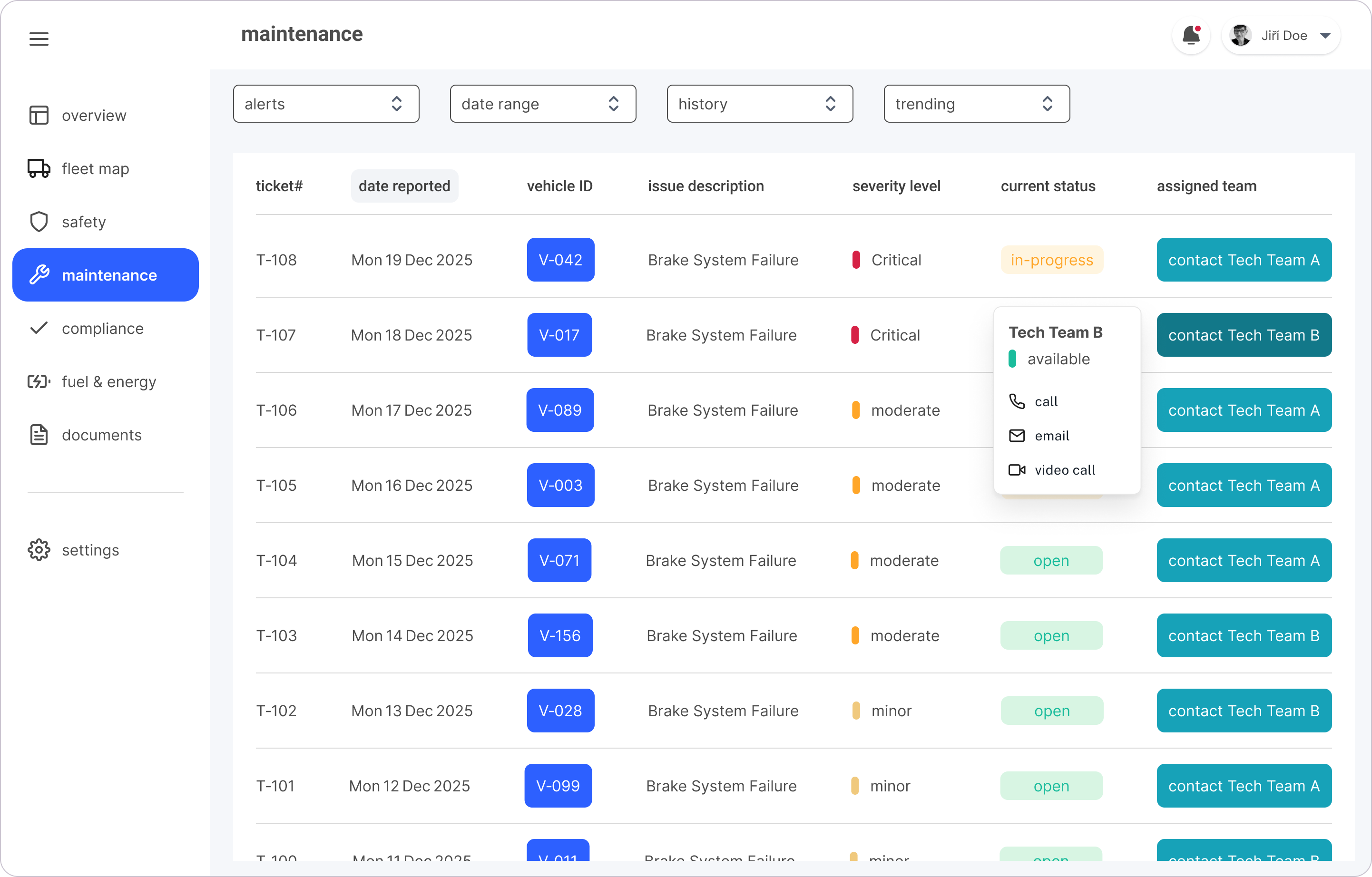
Delivered three core desktop experiences-Dashboard, Real-Time Map, and Maintenance view, each enriched with journey-map enhancements (congestion-indicator overlays, a one-click Contact Tech Team X button, a Boarding-Delay tooltip, and an Accident-alert hover that gives an actionable event preview). Presented as mid-fidelity mockups, they communicate the overall structure, layout and visual intent while enabling early detection of service impact → reducing operational blind spots.

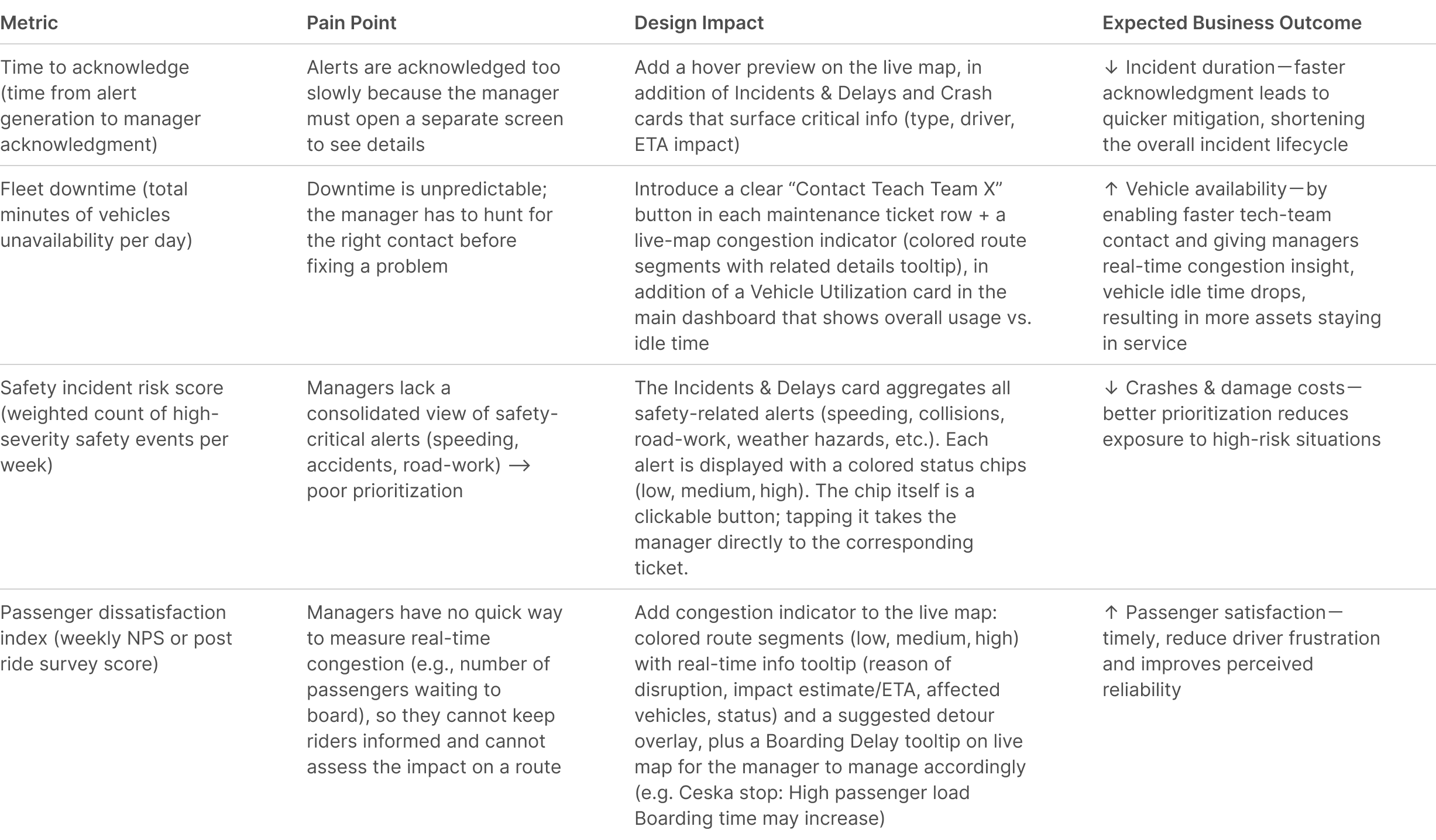
Expected Business + Operational Impact
While real fleet data was unavailable, the design changes aim at measurable improvements in decision-making speed, alert visibility, and service continuity. These expected impacts directly address the cognitive overload and blind spots revealed through field research.
Summary & Next Steps
Through usability testing, rapid iterations, and field immersion, I refined the dashboard to improve clarity, navigation, and in-context communication—enabling fleet managers to quickly contact the assigned maintenance team when issues arise. This iterative process revealed opportunities to streamline contact and alert workflows, establish a clearer information hierarchy and implement actionable improvements for critical UI components.
Moving forward, the focus will be on interviewing fleet operators to validate value through user testing via the Google Ventures Design Sprint framework, and applying participatory design methods-such as cultural probes-to build empathy by inviting users to share photos, videos, and personal notes that reflect their daily workflows and pain points. This will inform the iterative refinement of existing screens, the addition new high-priority features, and continuous user testing ensuring the dashboard remains intuitive, efficient, rooted in real-world workflows, and aligned with fleet managers’ needs.