Hypotheses
Hiko is a social audio app for listeners and creators (podcasters, streamers). Initially, the app struggled with navigation issues and inconsistent UI, making it hard for listeners to browse content or exit live streams. We thought addressing these would naturally fix engagement—but deeper research revealed a bigger problem: Hiko didn’t support creator–listener relationships.
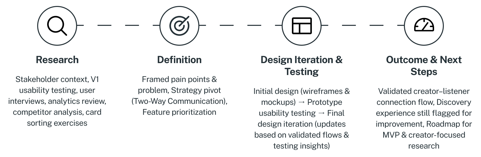
Research
Integrated Initial Research Phase (Stakeholder Inputs)
Before my involvement, the stakeholder had explored the space through:
- Conversations at radio events (Paris Radio Show 2022 & 2024), where direct access to streamers was limited, but connections with podcasters highlighted real frustrations
- Reddit desk research, revealing creator pain points like discoverability, burnout, lack of guest access, and monetization challenges
- V0.9.1 and V1 app launches to test early interest — but few structured insights were gathered from those releases
- Google Ads campaigns (limited success, possibly misaligned targeting or creative assets)
- Assumption: Amateur streamers need a low-pressure space to practice, experiment, and improve their hosting skills before going professional.
Deepening Insights Through First-Hand Research
Here’s how I explored user needs and behaviors firsthand.
- in-person interviews with 5 podcast and music enthusiasts in cafés/library spaces to uncover needs around discovery, organization, and sharing
- Initial usability tests on the first app version (V1), watching users struggle with navigation and exiting views
- Google Analytics review that showed high bounce rates, short visits, and low play activity
- Digital Ethnography via Reddit research and Desk Research for podcasters & streamers insights, since direct access was limited
Research Insights
Drawing from stakeholder research, digital ethnography, in-person interviews, and usability testing, key patterns emerged across creators and listeners:
For Podcasters & Streamers (Creators)
- Struggle to grow audience due to saturated platforms and poor discovery tools
- Desire deeper audience interaction through direct, live, or semi-direct engagement
- Lack tools to stay connected post-publishing, especially outside social media
- Value autonomy and creative freedom, but face isolation, burnout, and monetization challenges
- See live audio as a potential tool, but motivation depends on perceived audience value and ease of use
For Listeners
- Listeners prioritize easy discovery of new and familiar content through mood, genre, or personalized recommendations
- Frustrating search and navigation experiences are a common barrier to enjoyment and platform loyalty
- Sharing music with others is a core part of how listeners engage emotionally and socially with content
- Users want more context about artists and music to feel more connected to what they’re listening to
- Poor playlist organization tools limit control and satisfaction, especially for power users managing large libraries
From usability testing
Usability tests revealed common frustrations: users got stuck inside live stream views and didn’t know how to exit — iconography wasn’t clear, and navigation patterns were inconsistent
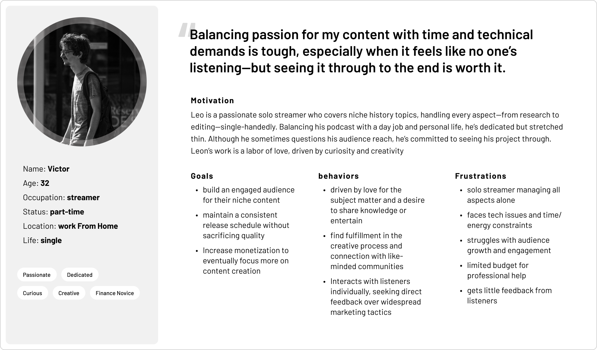
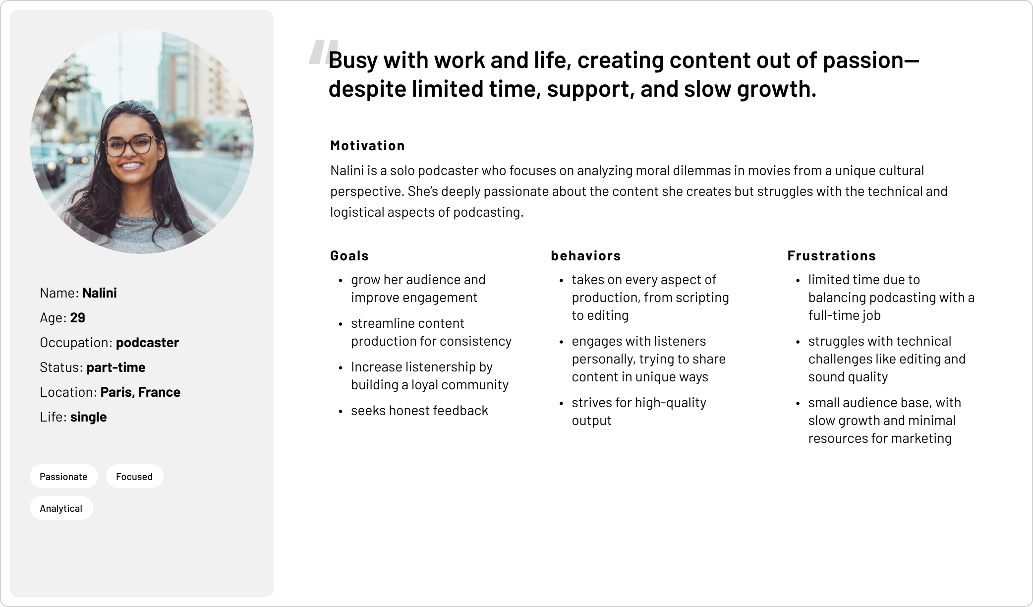
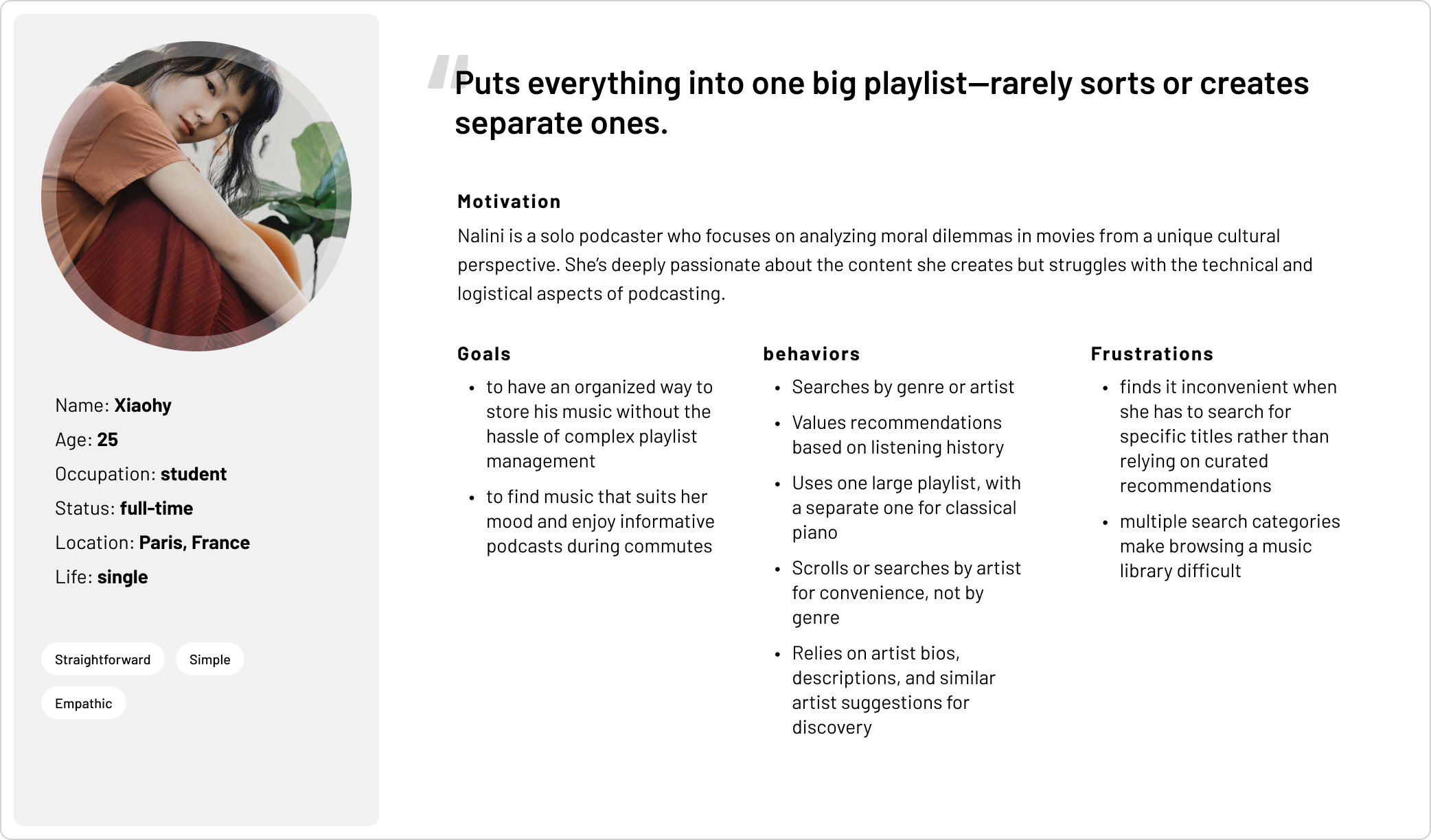
Based on interviews and usability tests, I defined three personas that reflect key user segments: the streamer, the podcaster, and the focused listener.
Problem
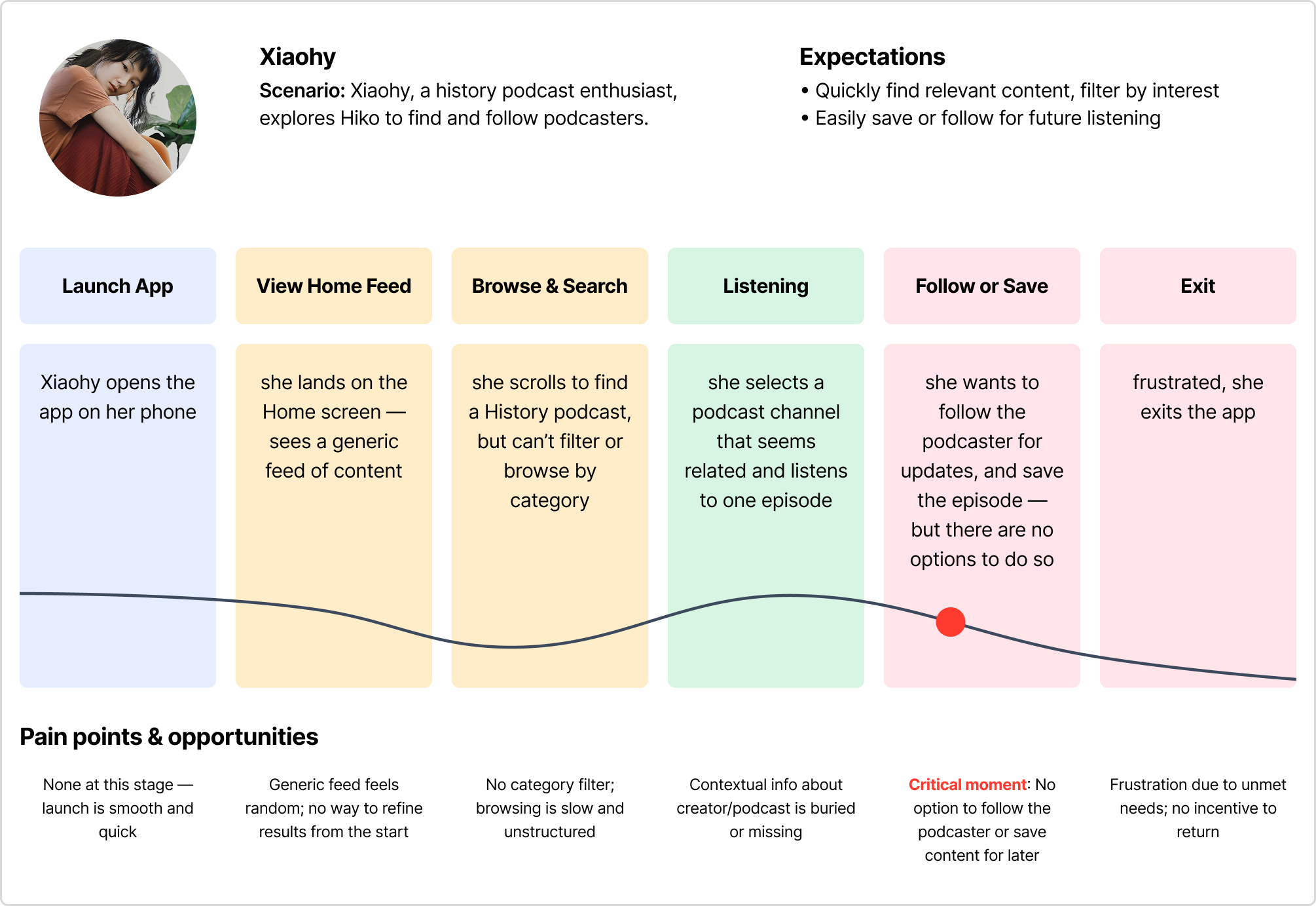
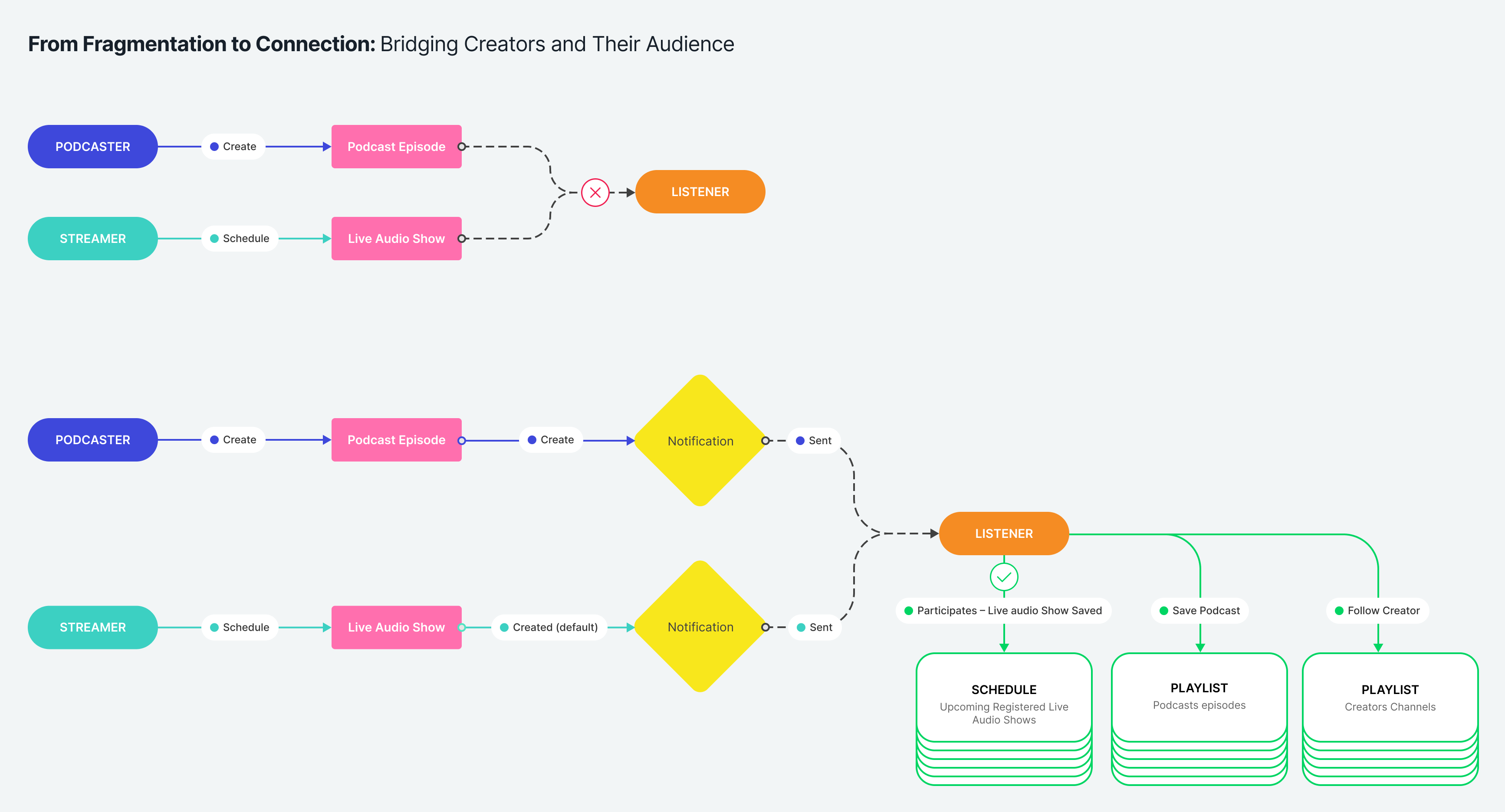
After defining our personas, I mapped a user journey for a podcast listener who wants to easily follow a favorite podcaster and get updates on new episodes.
The journey revealed a major issue: listeners struggled to quickly access and stay connected with podcasters. This caused friction in discovery and ongoing engagement. The core problem: the initial design execution unintentionally prioritized listeners (due to initial UI/UX choices). The app lacked simple, intuitive pathways for listeners to follow creators and receive notifications about new content, which can negatively impact user retention and satisfaction.
This insight refocused the project by realigning the product so the listener-heavy design would shift to creator-first, balanced with listeners, and creating clearer connections between listeners and podcasters, streamline discovery for foster ongoing engagement.
Ideation
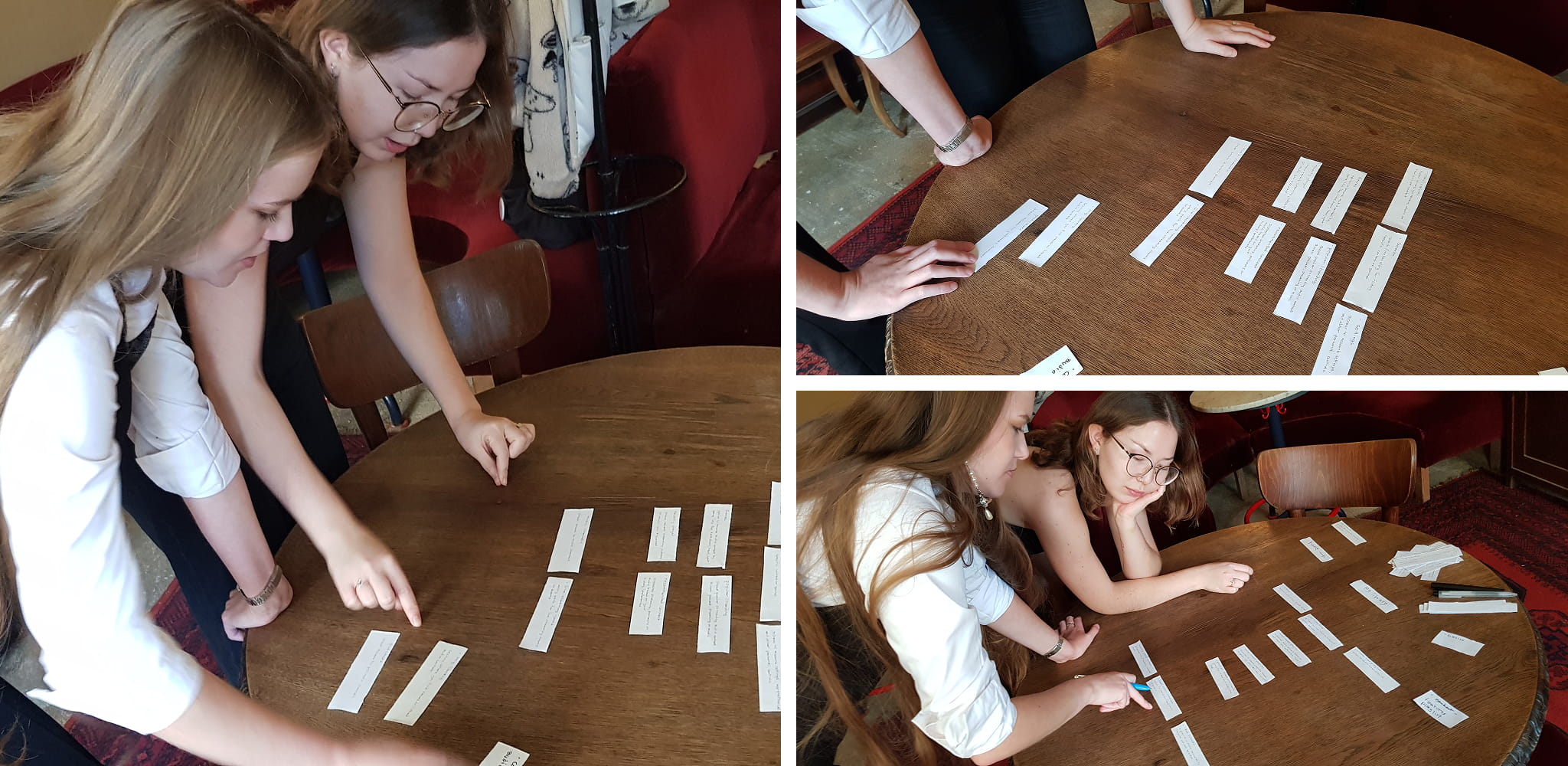
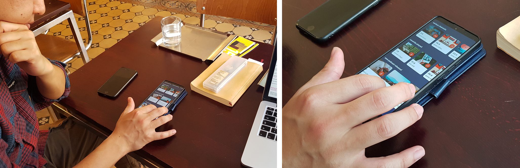
Early in the process, I conducted a card sorting session with 2 users in a café to better understand users’ mental models and expectations regarding content organization and navigation.
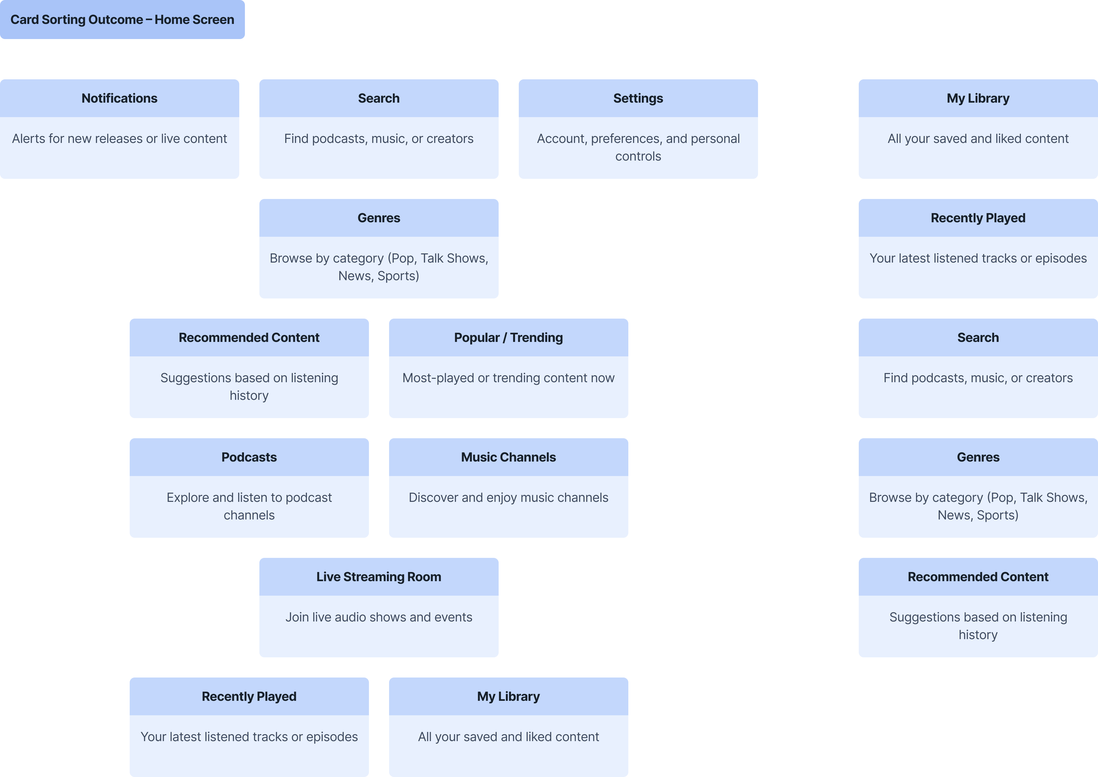
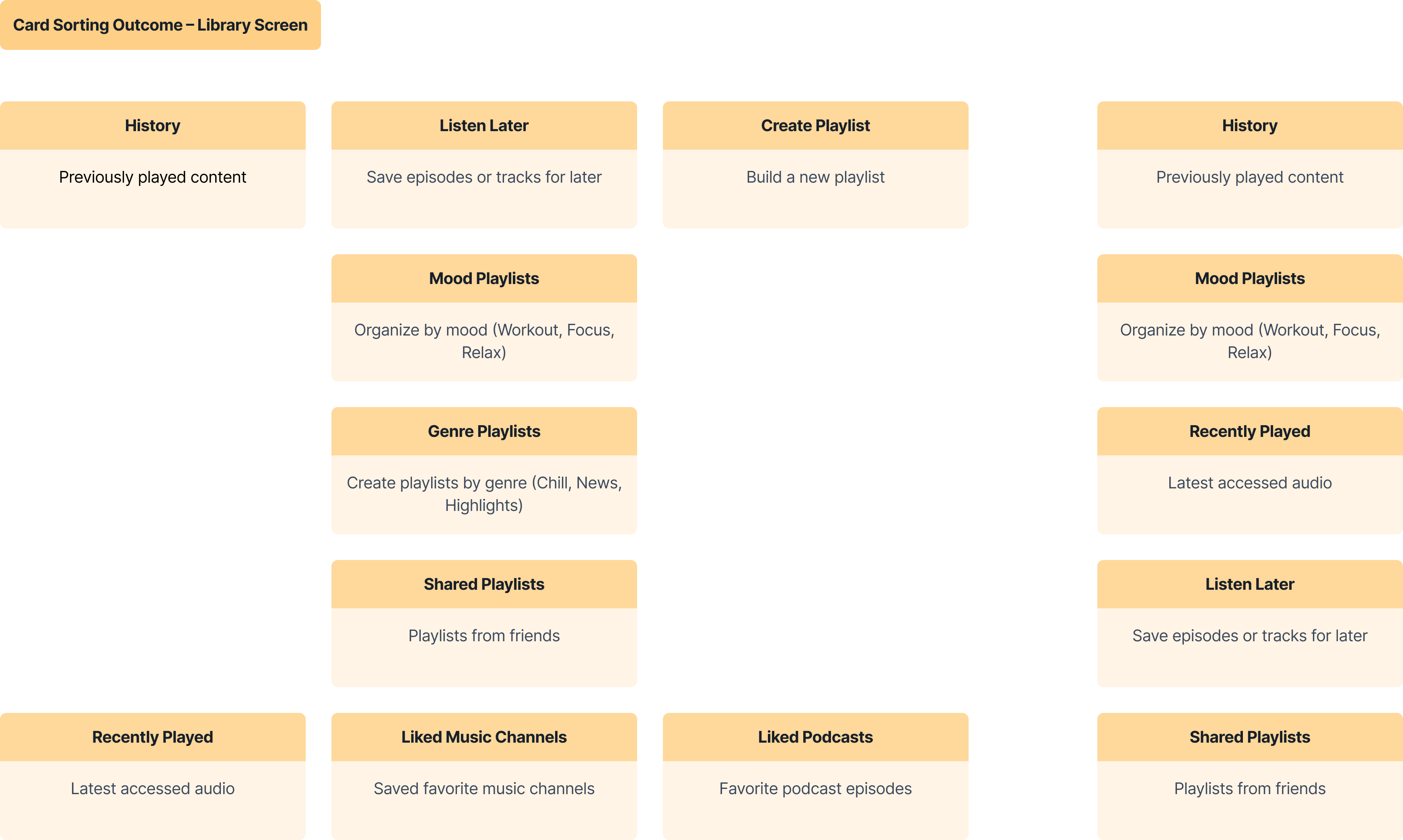
Card sorting summary: users value easy access to their listening history and personalized playlists based on mood or interests. They want simple ways to save content for later and share playlists with friends. Additionally, efficient search and browsing by genre are essential, alongside personalized recommendations to discover new content.
At this stage, I revisited the competitive landscape to benchmark Hiko’s feature set and identify key opportunities to improve audience engagement.
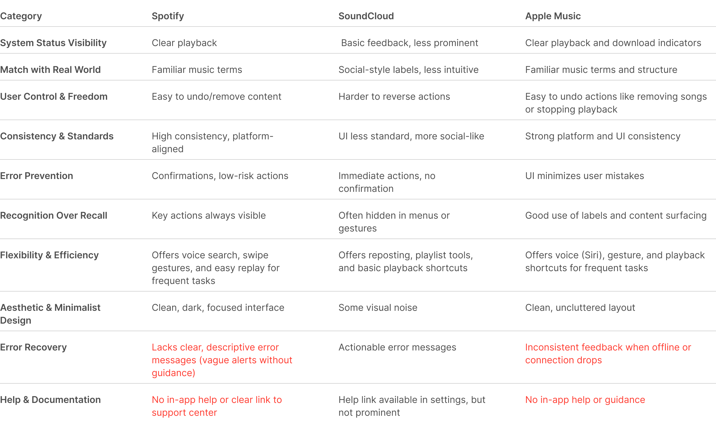
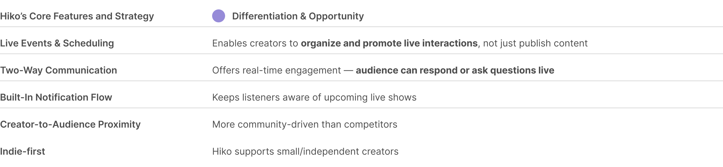
Opportunity Insight: Hiko differentiates through a stronger community layer: enabling independent creators to host, notify, and engage directly with listeners. This peer-driven model is more participatory than Apple's top-down content delivery. Neither Spotify nor SoundCloud supports scheduled, interactive, in-app events with reminders and creator-led interaction.
Experiments & Refinement
With clear pain points identified, insights from research and highlighted opportunities from competitor's feature comparison, i began sketching and wireframing features to improve the connection between listeners and creators.
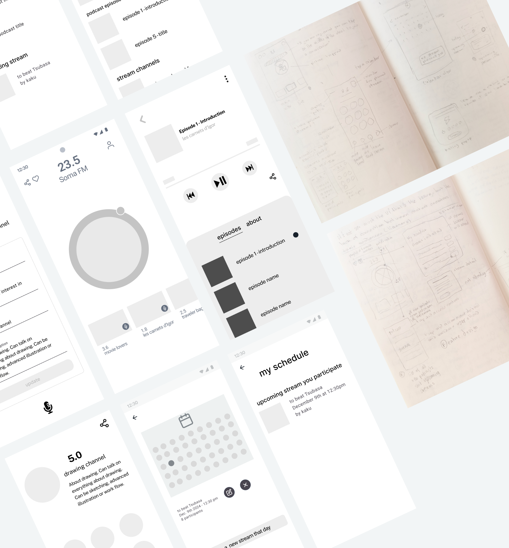
I iterated from paper sketches and wireframes to digital mockups, refining layouts and interactions based on team feedback.
Solution
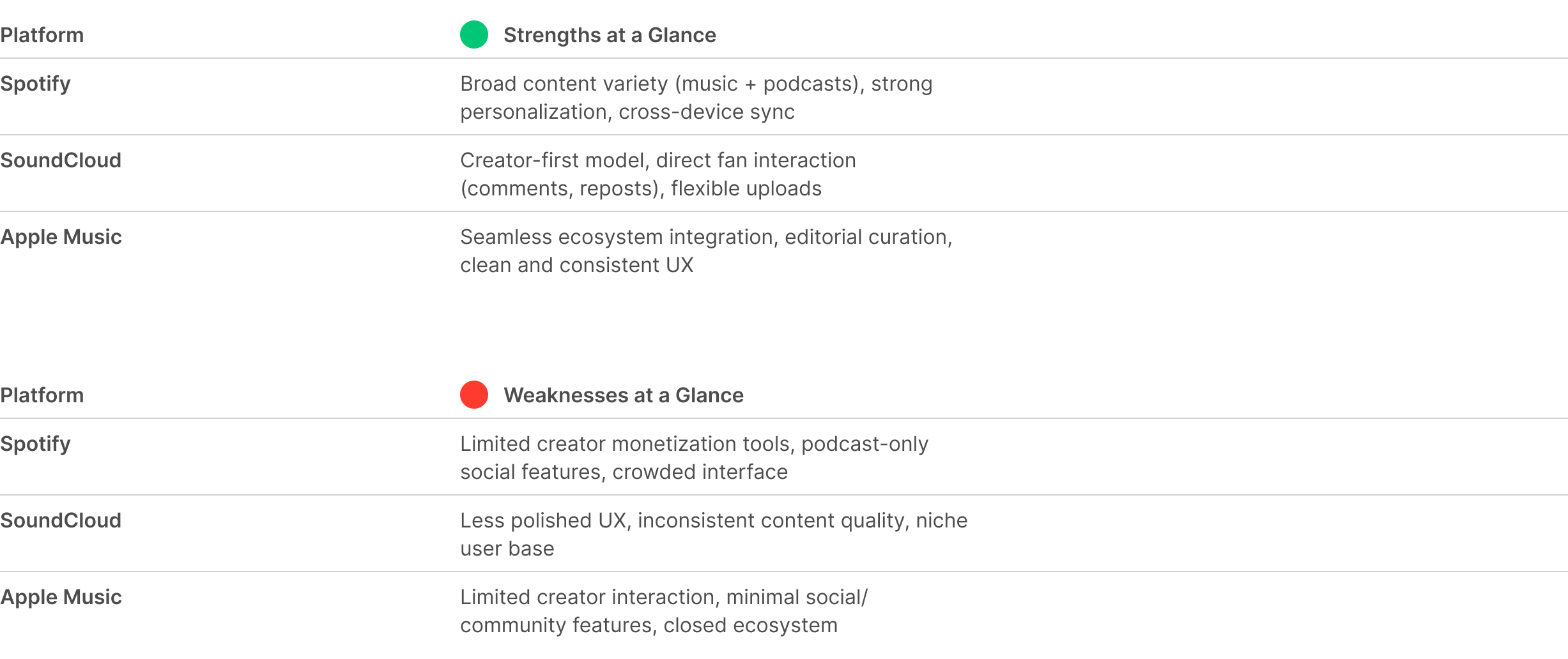
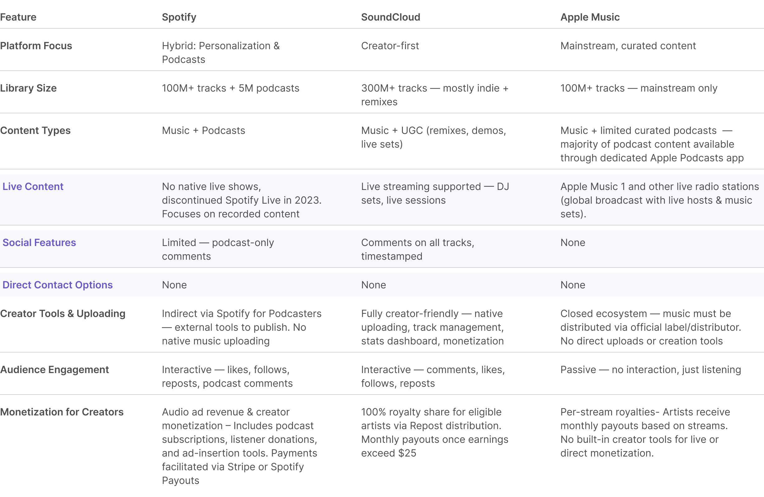
While Spotify and SoundCloud offer powerful discovery and playback tools, social interaction is limited — comments across tracks are restricted to SoundCloud, and direct engagement is minimal.
Hiko fills this gap by focusing on live, scheduled events and real-time audience interaction, giving creators direct access to their listeners — and giving listeners a chance to participate, not just consume.
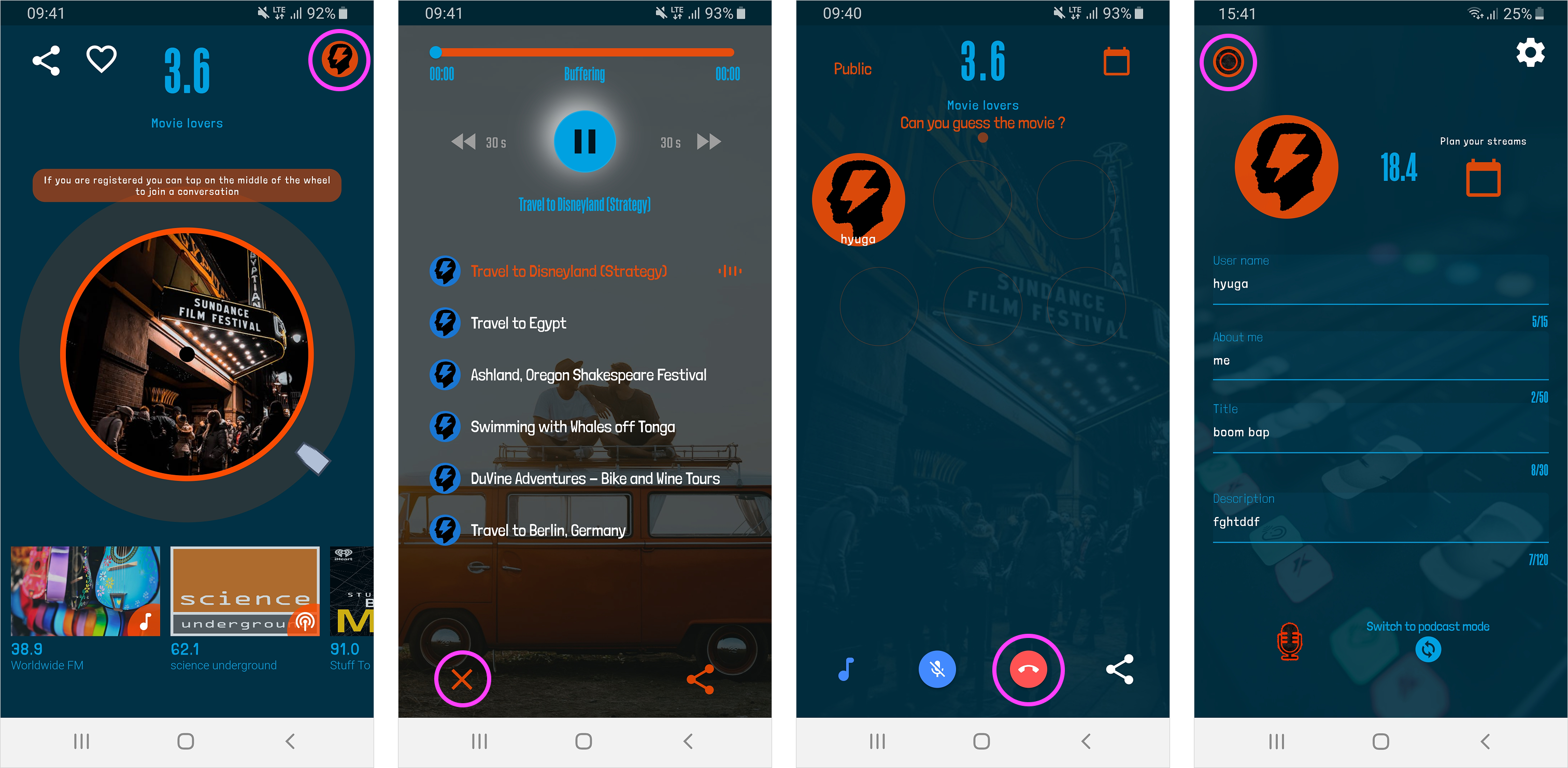
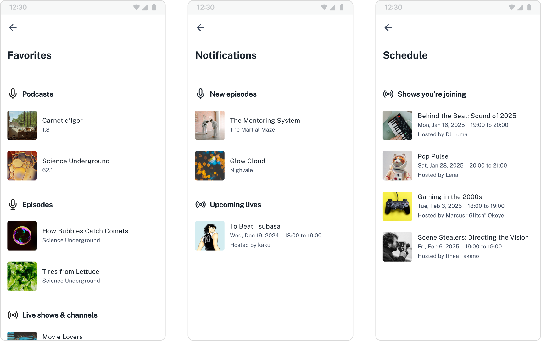
The updated design empowers both listeners and creators. Listeners can now save favorite content, get notified about new podcasts releases and live streams, and engage directly with streamers—building stronger, two-way connections. Meanwhile, creators gain tools to stay visible and grow their audience.
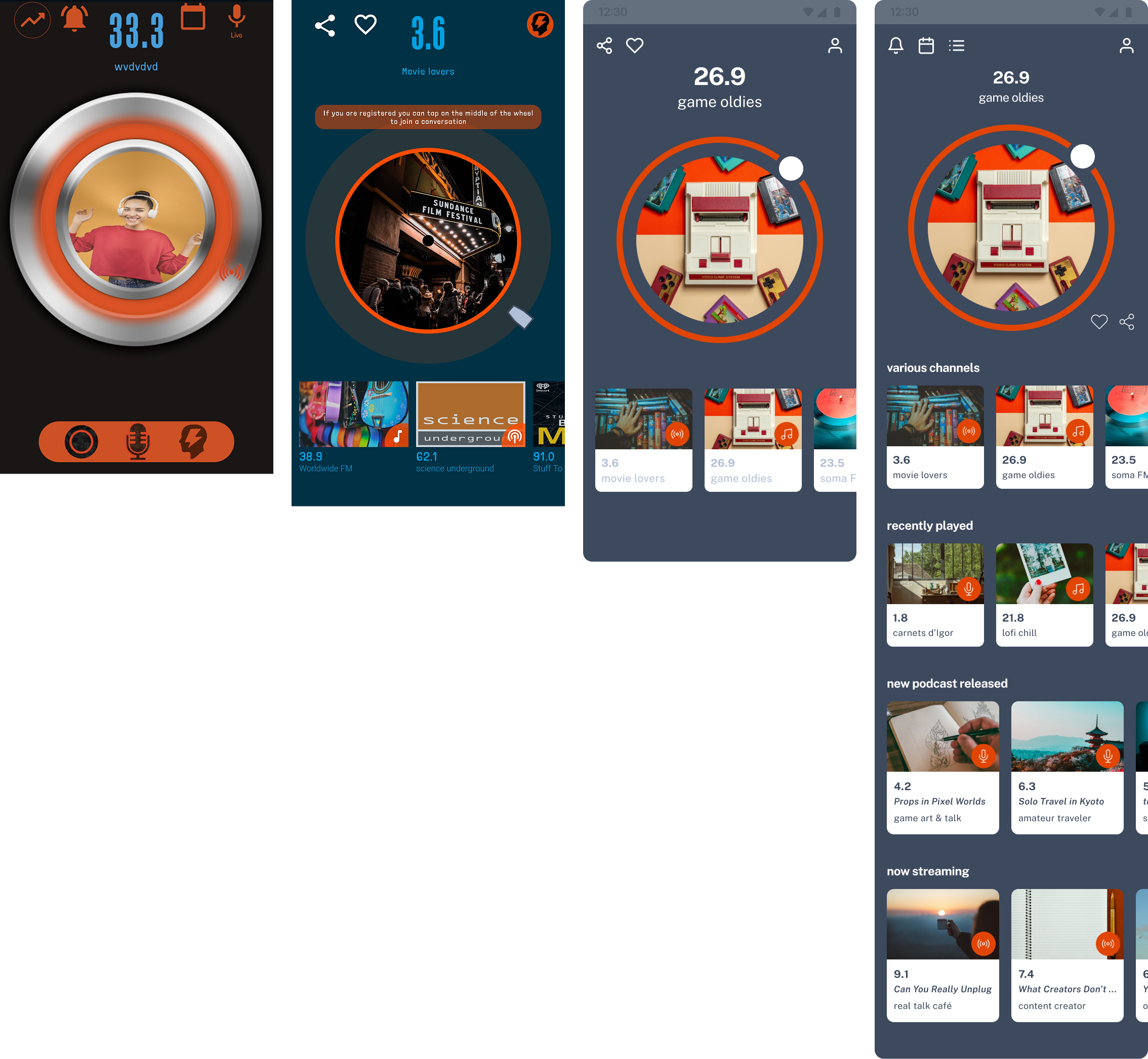
- Home view with discovery zones
- Library with saved content
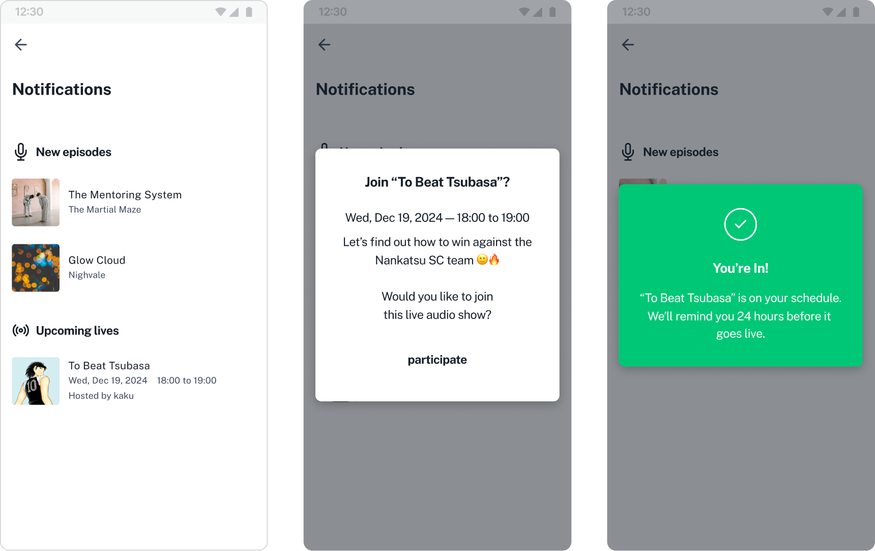
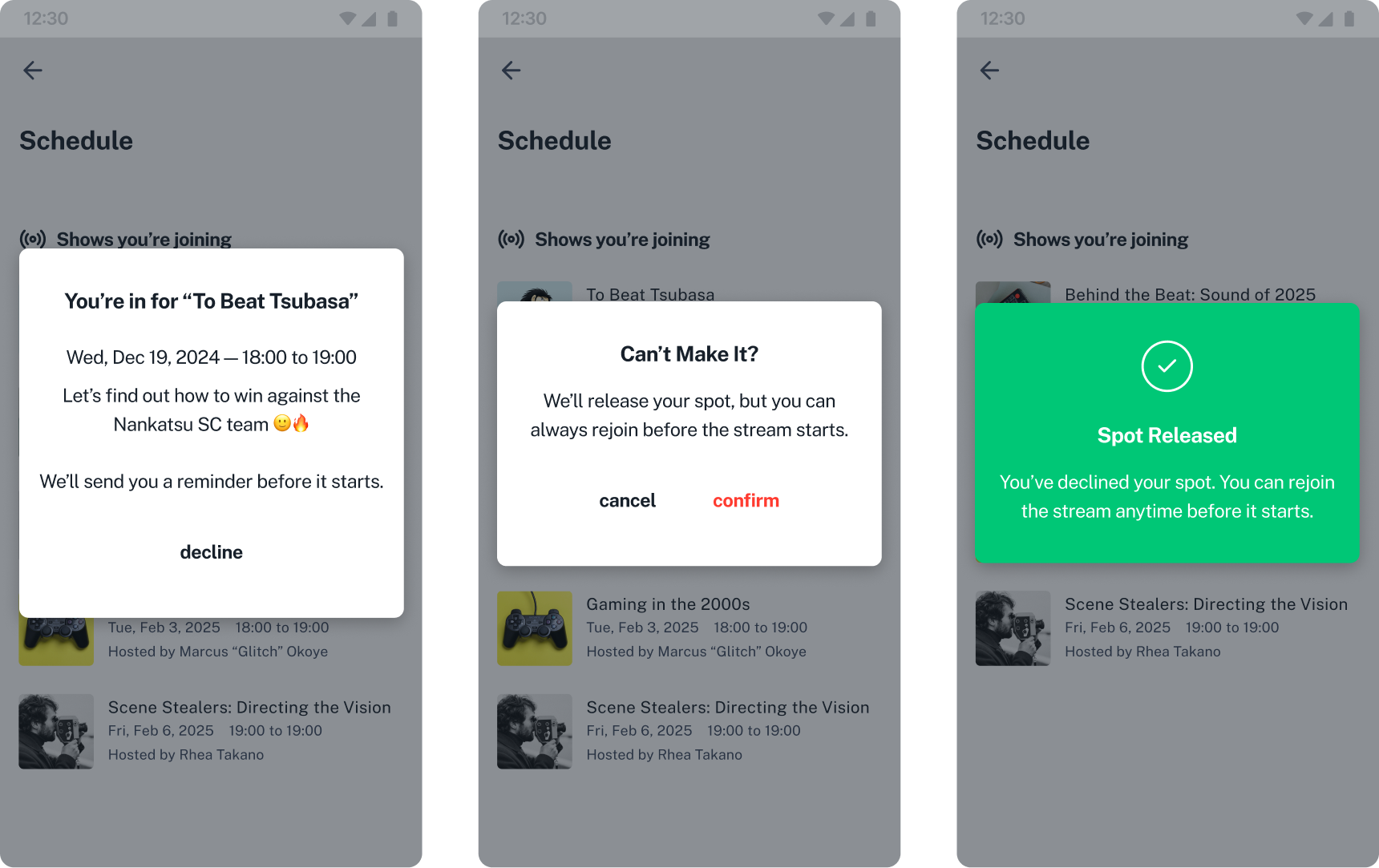
- Notification center
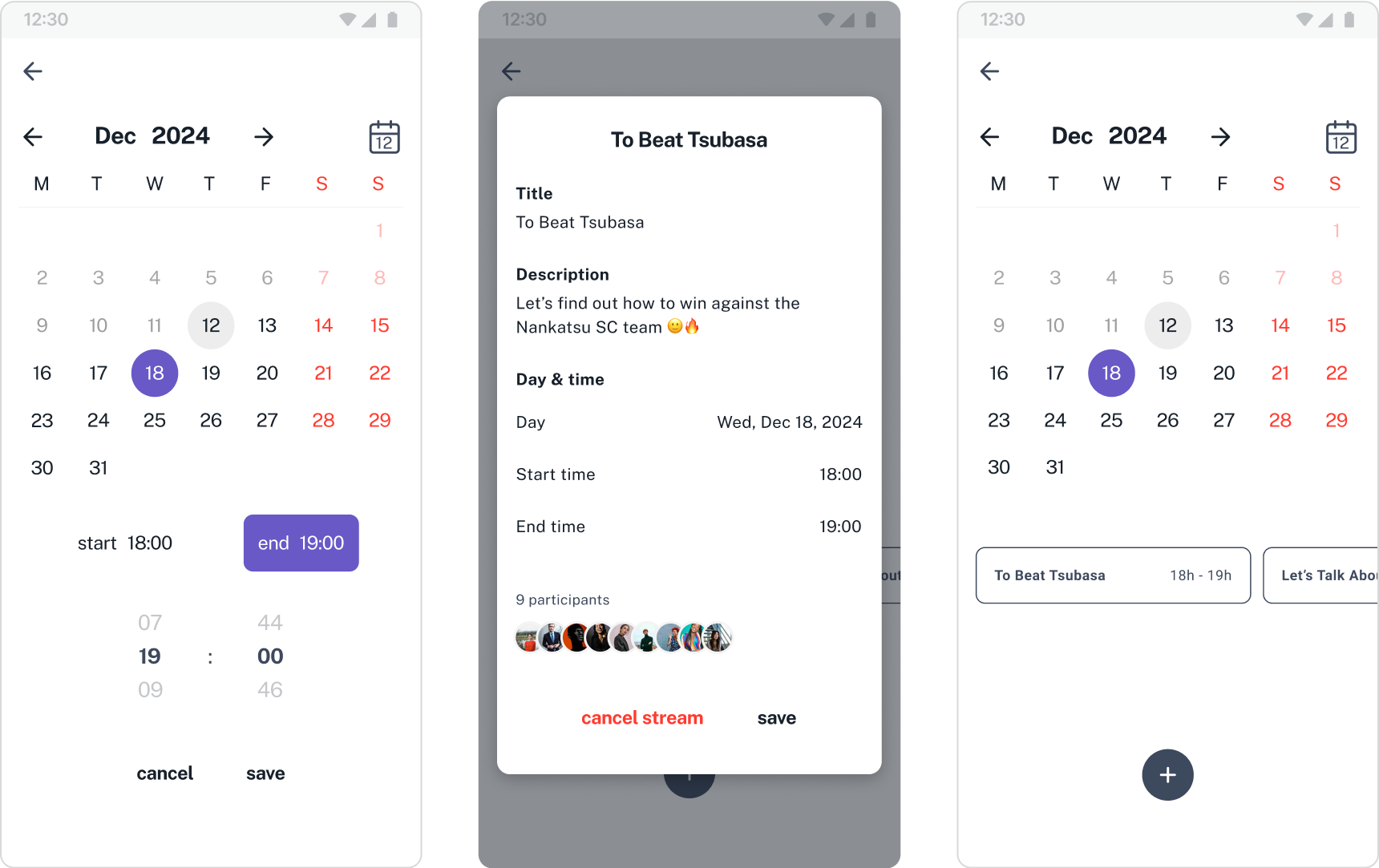
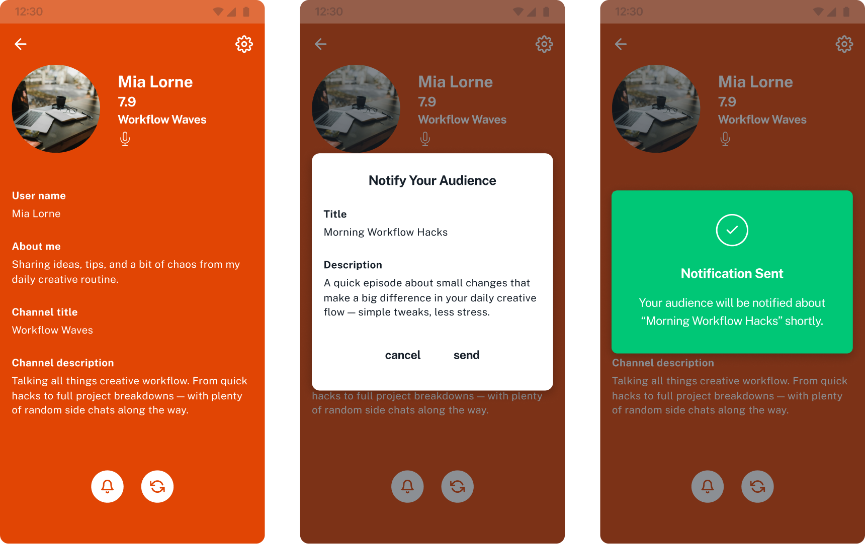
- Scheduled live events (for podcaster and streamer to create event and listener to confirm the attendance and save the event)
- Clearer navigation
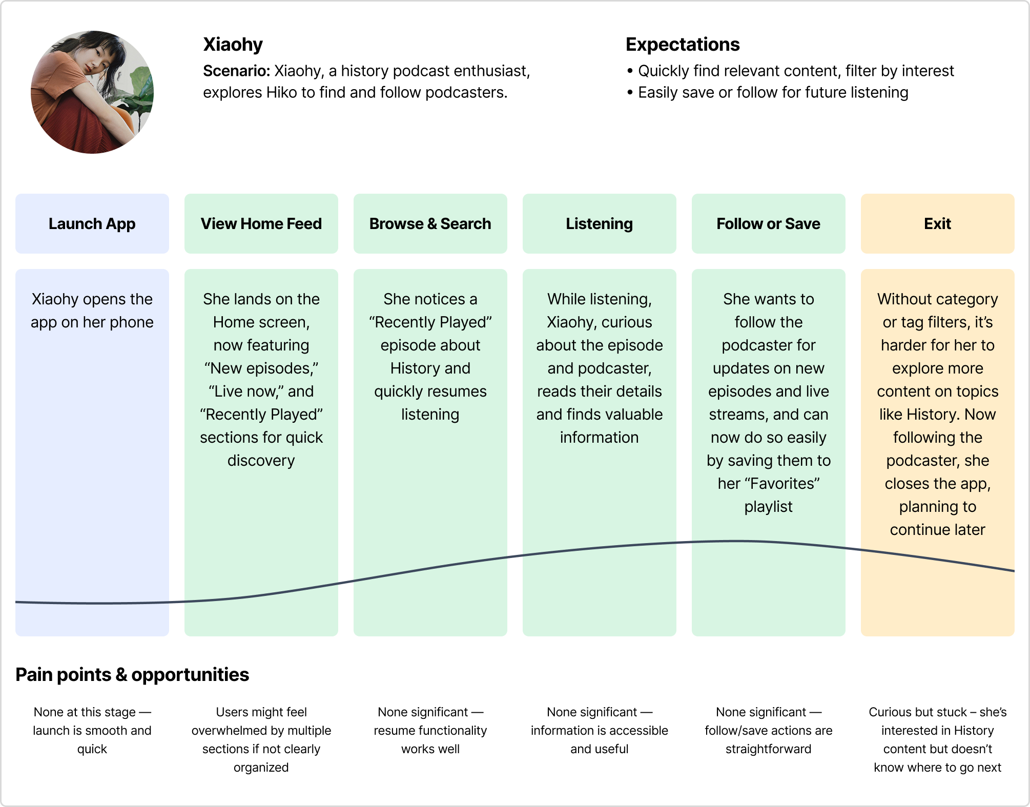
Building on these insights and features, I created a new user journey illustrating how a podcast enthusiast, navigates through the updated app — from quickly discovering recent podcasts to engaging more with creators and sharing content with friends.
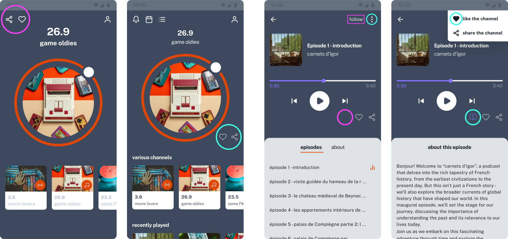
Refinements After Prototype Testing
After testing a Figma prototype with 4 users in informal settings, key insights surfaced around content discovery and the Creator–Listener connection. This iteration focused on refining navigation, onboarding, and labeling to improve clarity and first-time engagement.
While Discovery will evolve in future updates, this round aimed to validate how users understand, engage and join live audio shows. The changes below reflect improvements made before MVP release based on direct user feedback.
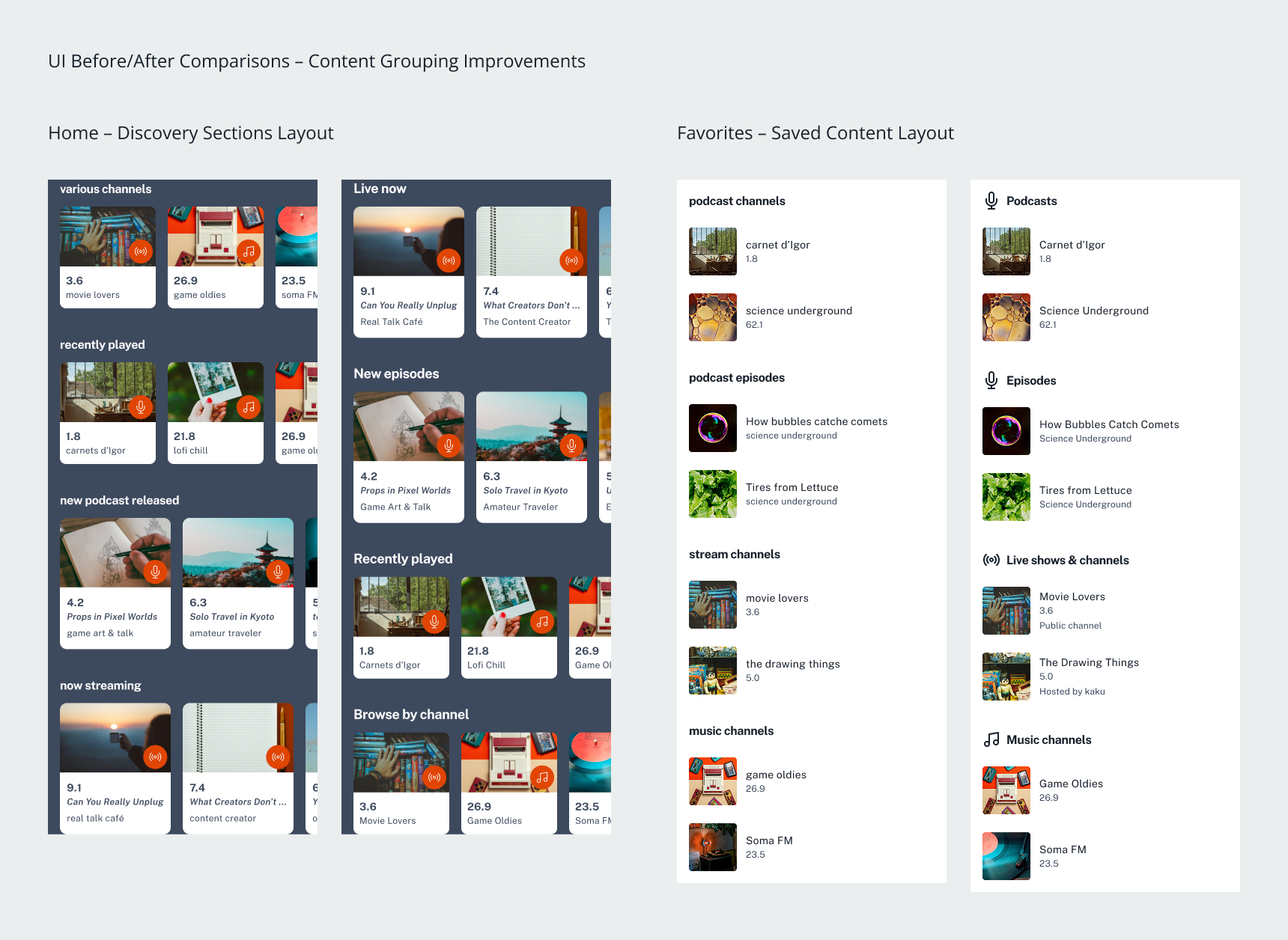
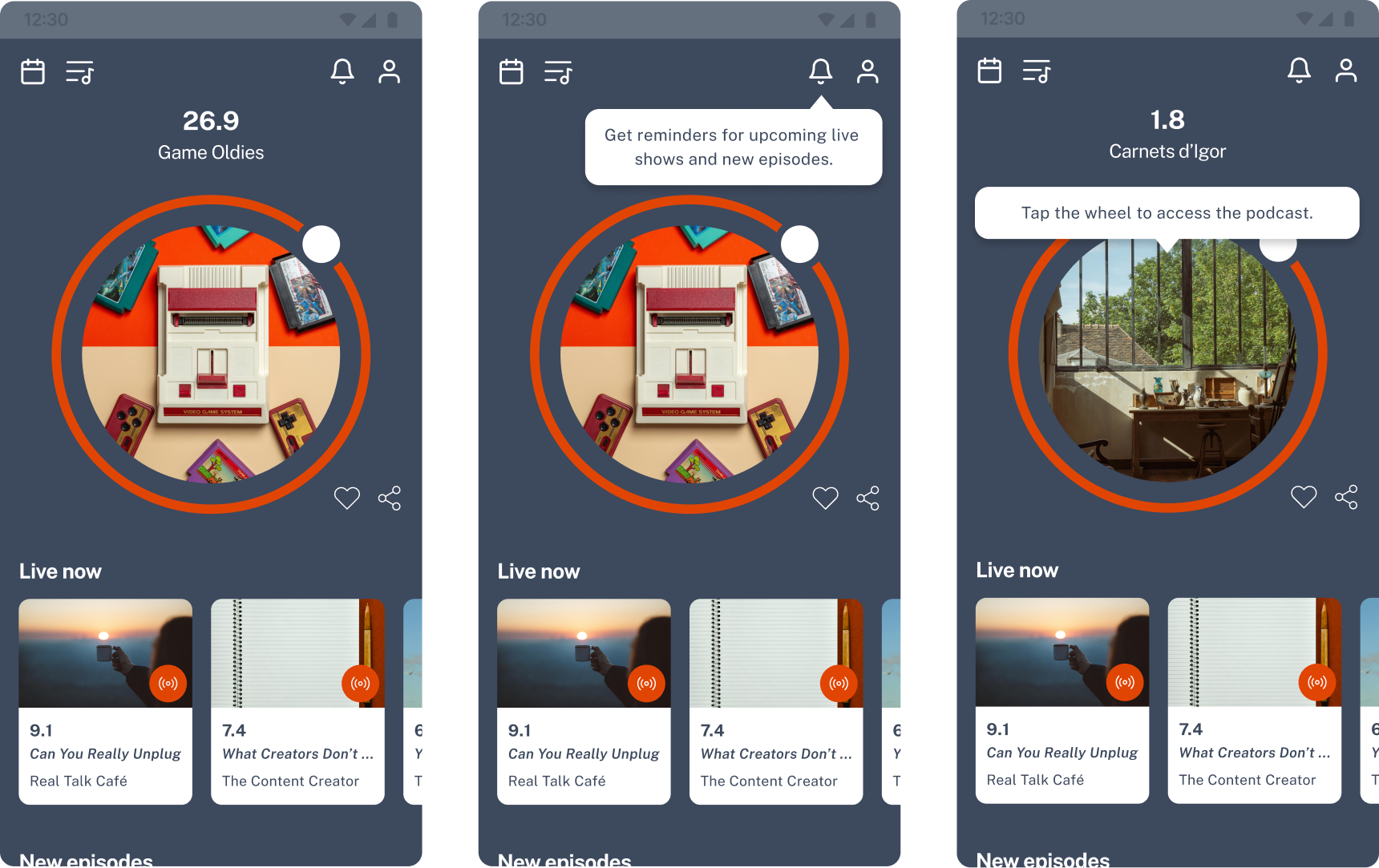
1. Content Discovery
To support quicker access and reduce friction during exploration,
key content areas like Home screen sections were retitled for
clarity and
reordered to prioritize live and fresh content. The Favorites
view was restructured to separate saved episodes, followed shows,
and channels. These changes aimed to improve content legibility and
surface relevance, while setting a stronger foundation for
discovery.
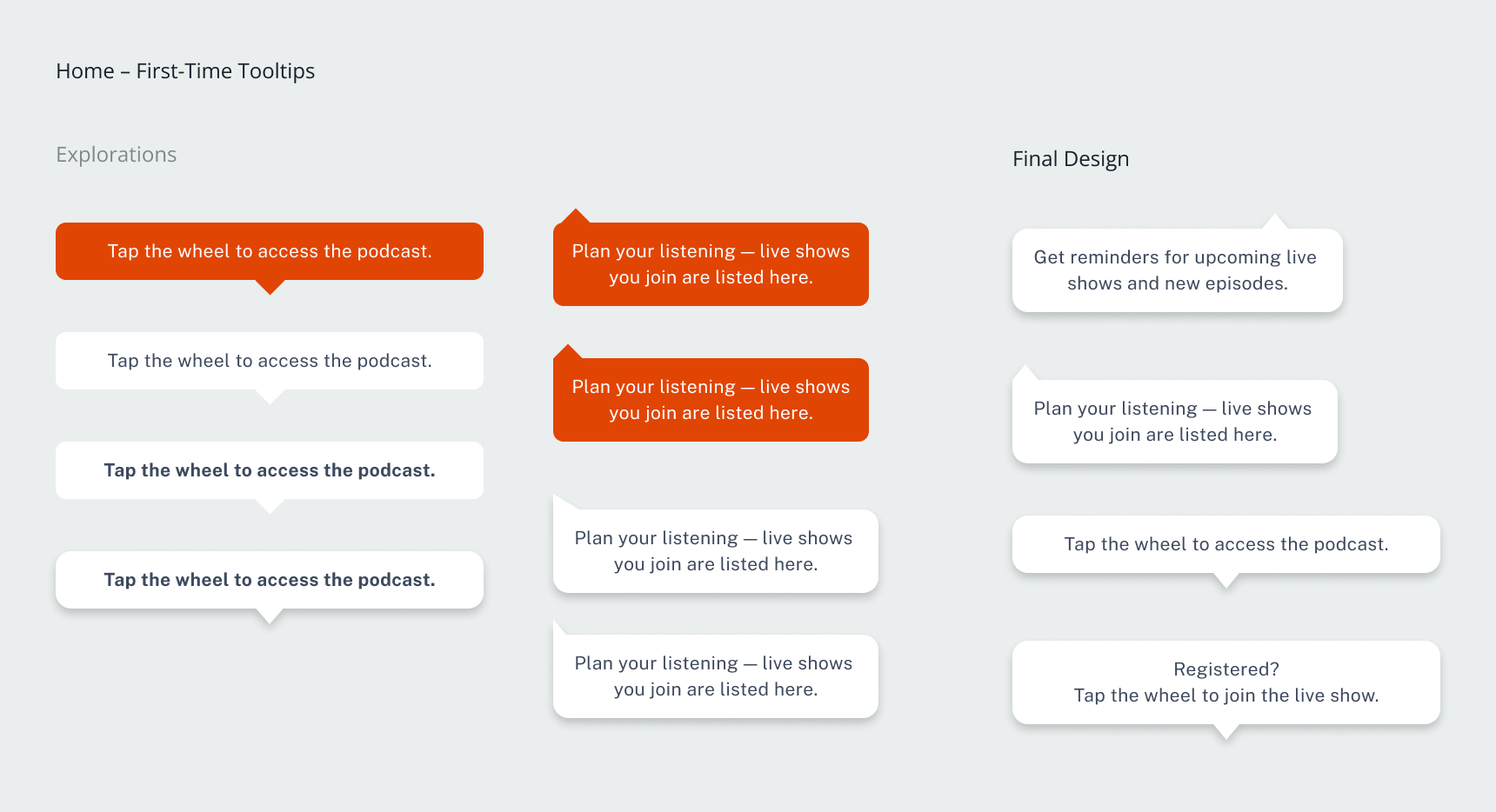
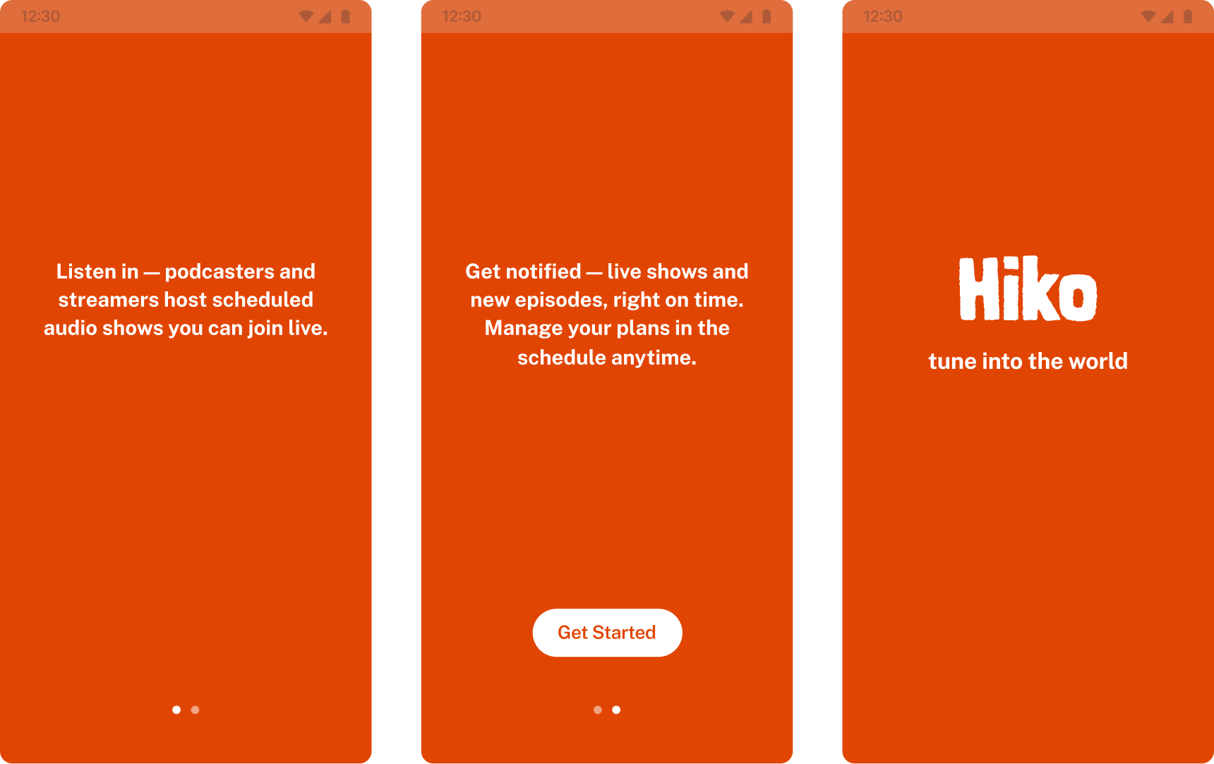
2. Onboarding & First-Time Use
To support orientation and early engagement, a short onboarding
sequence was introduced before the splash screen. It highlights the
app’s value and how to engage with live content.
Contextual tooltips
were also added to guide users through Notifications and Schedule
the first time they’re used. These additions help
clarify core flows and reduce ambiguity during initial
interactions.
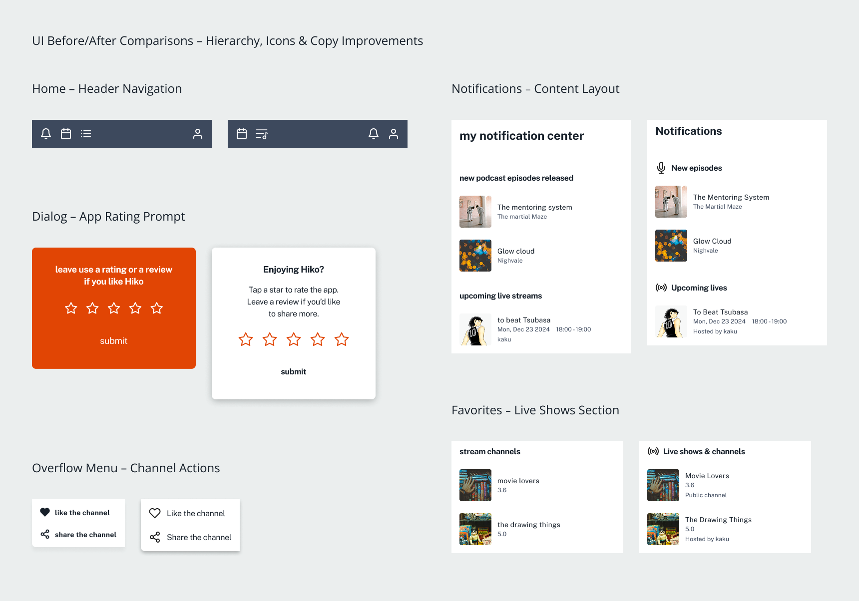
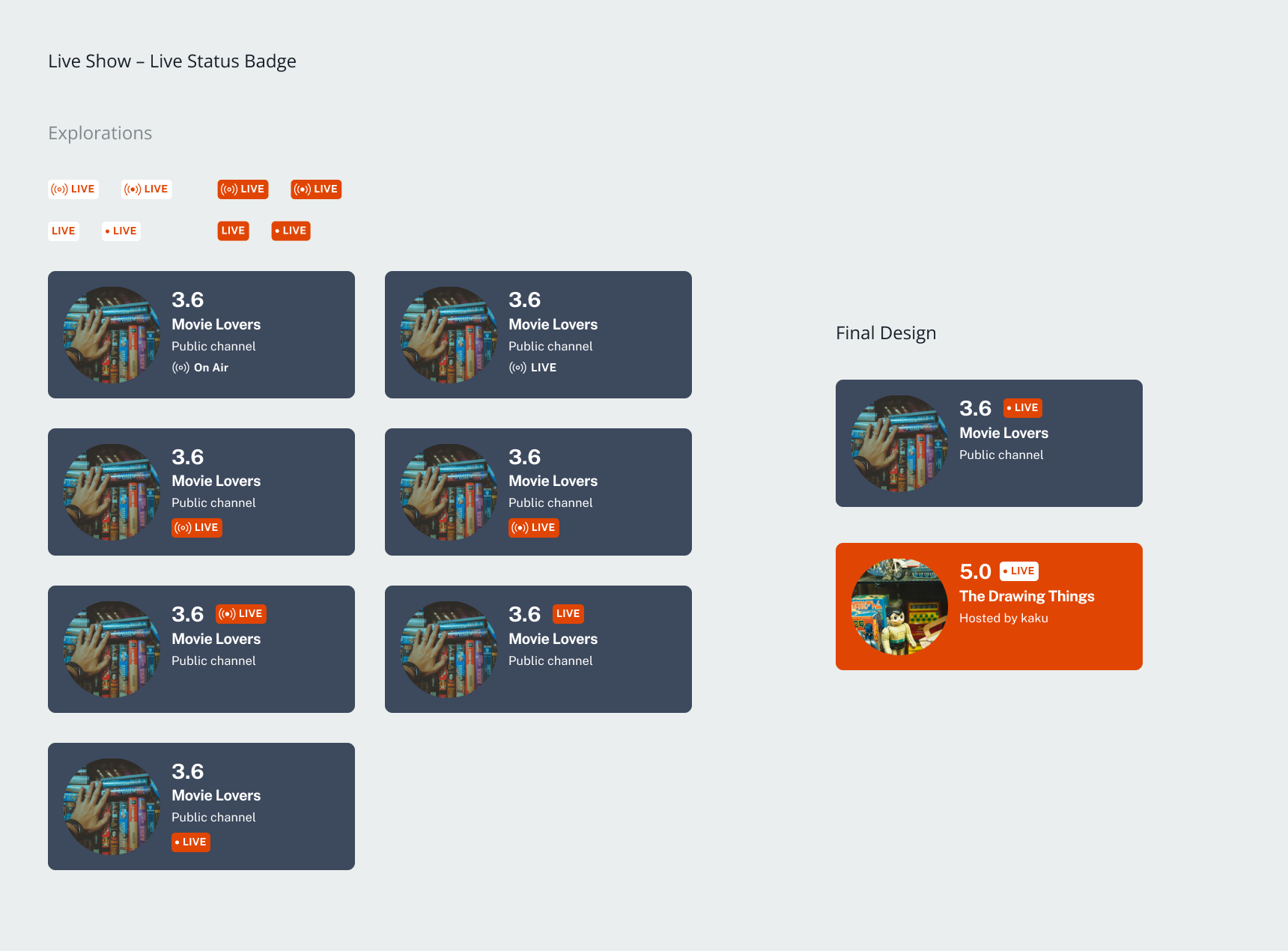
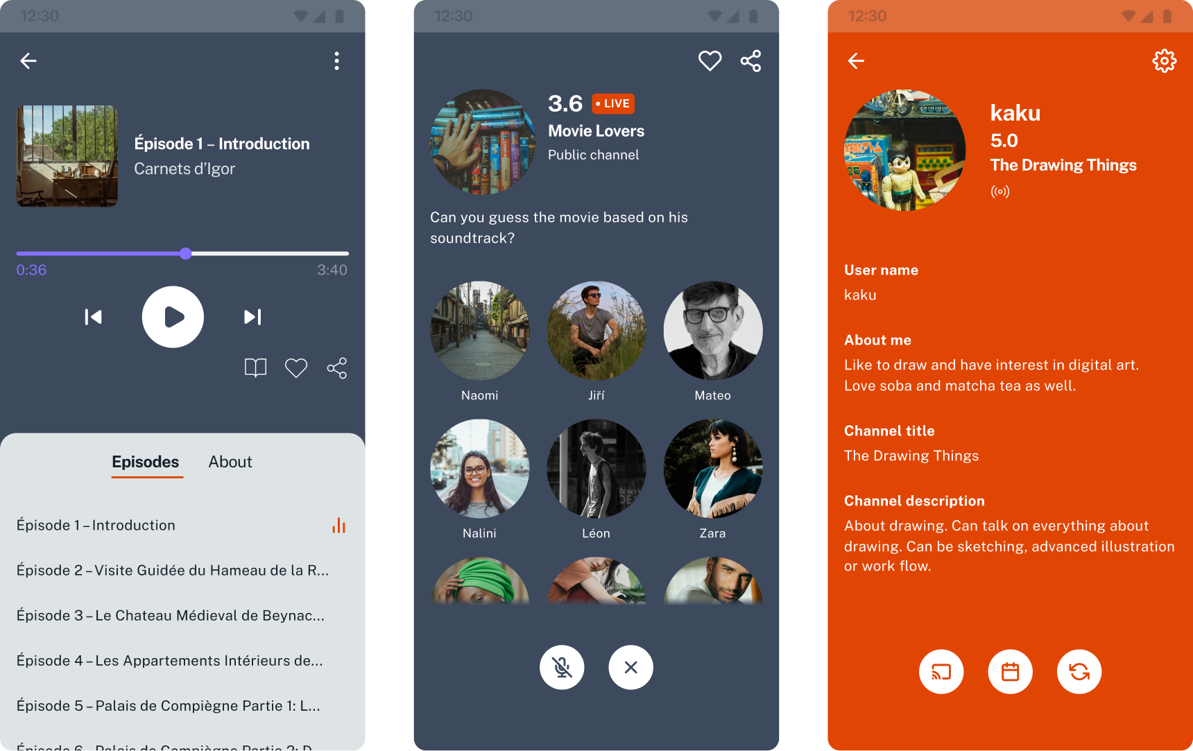
3. Navigation & Layout
To streamline interactions, several layout adjustments were made
across key screens. Top navigation icons were consolidated for
better clarity. Tap areas were expanded and
spacing optimized to improve usability. Redundant action
buttons were removed, simplifying flows without compromising
functionality. Together, these refinements make the interface feel
lighter, faster, and more intuitive.
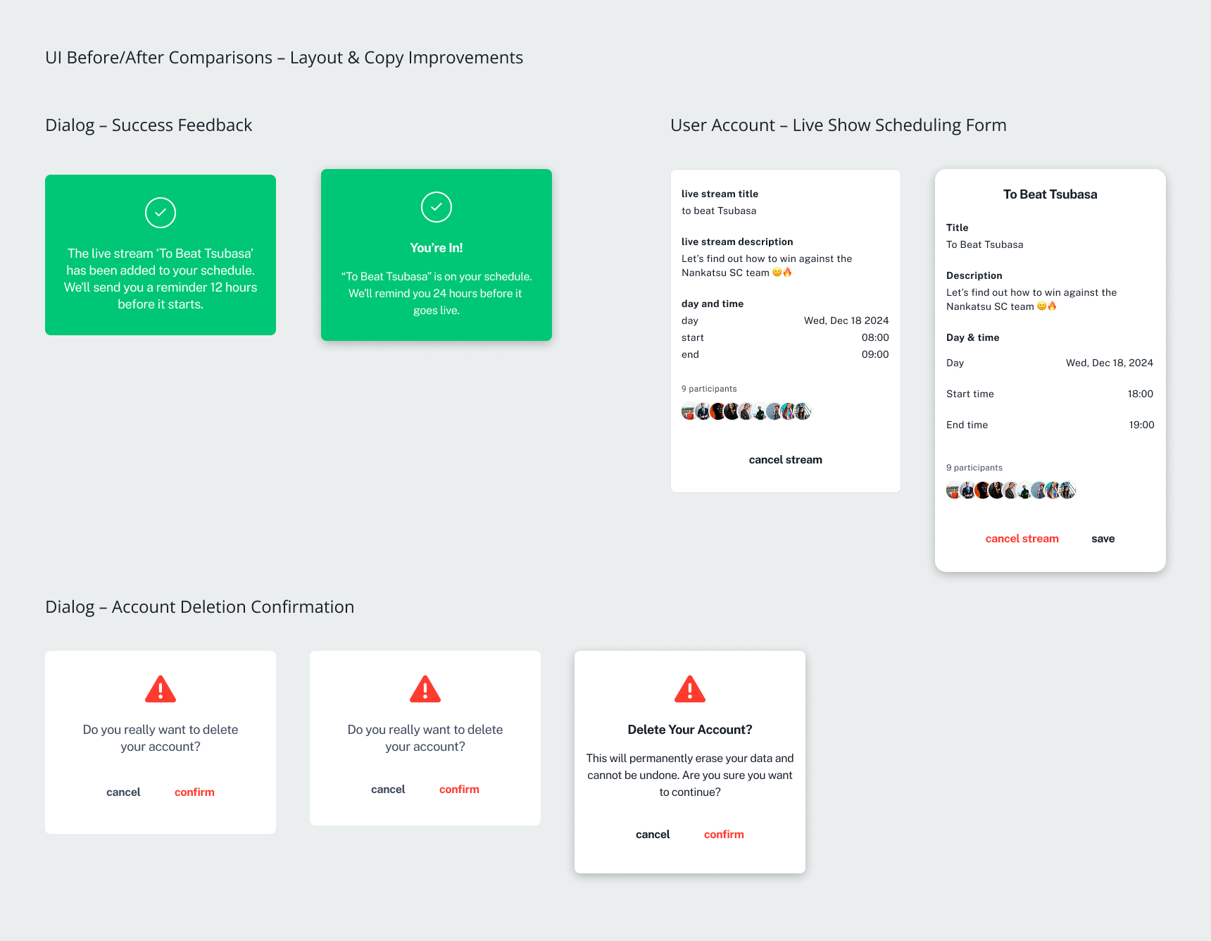
4. Visual Hierarchy, Iconography, Copy & Labelling
To improve first-time comprehension and
reduce cognitive friction, copy and visual cues were refined
across the app. This included simplifying section labels, aligning
naming conventions, improving icon choices, and
reinforcing hierarchy
through size, spacing, and tone.
Outcome
The showcased high-fidelity designs below represent a sample of the broader design work, which also includes Settings, dialogs, and interaction flows.
Next Steps
Last usability testing confirmed two testing focuses: users clearly understood how to connect, engage, and participate in live content, and the content discovery experience remains a friction point, requiring focused iteration. To move forward with confidence, I would prioritize a new round of qualitative research with both podcasters and streamers using the Google UX Interview Format, to ensure the entire value chain of the product is not at risk. Based on those findings, I recommend refining the prototype into a lean MVP focused on the most validated features (live interaction, basic discovery, creator presence), and launching a private beta with a limited creator cohort to test long-term engagement and retention in real conditions. This will allow targeted iteration based on live usage rather than assumption — bridging insight to measurable traction.
Product Perspective
Throughout the design process, i considered not only user experience but also the product’s positioning in a competitive audio-streaming landscape. By identifying creators pain points around audience engagement, we proposed features like live event scheduling and real-time audience feedback, —helping differentiate Hiko from platforms like Spotify and SoundCloud.
By prioritizing such features, the design aims to increase users retention, support community growth, and build a unique value proposition. These were selected as part of an MVP strategy—balancing user needs, market gaps, and feasibility in collaboration with stakeholder.
We scoped future phases, allowing us to maintain a lean, testable experience while keeping the broader product vision in mind. This approach ensured that design decisions remained grounded in current insights, rather than assumptions, and set the stage for iterative validation in subsequent development.
Conclusion
This project reinforced that the UX process is rarely linear﹣progress often comes through cycles of exploration, reframing, and iteration.
By combining user interviews, analytics, and usability testing, I was able to uncover multiple layers of usability challenges that might not have been revealed by any single research approach.
I also learned that rapid, iterative design cycles validated by usability testing are essential to keeping solutions aligned with user needs. Confronting design hypotheses early and often with real users allows for more informed adjustments, rather than relying on extended design phases before validation.