Hypotheses
- The original website lacked clarity, coherence, and clear CTAs, resulting in low engagement.
- Aligning the SPA design with the mobile app could improve brand trust and overall usability.
- Providing clearer structure and tangible product previews would lead to better understanding and conversion.
When approaching the SPA redesign, I hypothesized that users were unsure what Hiko was or why they should try it. Addressing information hierarchy, interactivity, and messaging would directly impact usability and app downloads.
Research
- User Interviews (App V1): in-person interviews with 5 podcast/music enthusiasts to understand discovery and content-sharing behavior
- Usability Tests (App V1): Observed users struggling with navigation and exiting views
- Analytics Review (App V1): Google Analytics showed brief site activity with low content playback rates
- Community Research (App V1): Reddit discussions with content creators to understand their needs and pain points
This research built a dual perspective: listeners needed easier exploration and saving, while creators needed visibility and connection. The website had to appeal to both groups and clearly reflect how Hiko could serve them.
Problem
- website had no clear message or visual storytelling of what Hiko is or who it’s for
- CTAs were inconsistently placed and lacked affordance
- lack of interface previews left tech-savvy users skeptical
- interactive components were poorly signaled, especially on mobile
Without a clear hierarchy or value demonstration, even users interested in audio content wouldn't converting. I needed to redesign the information architecture and reframe how product and story flowed across pages.
Ideation
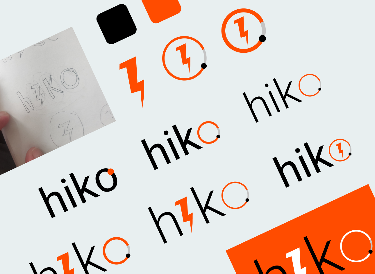
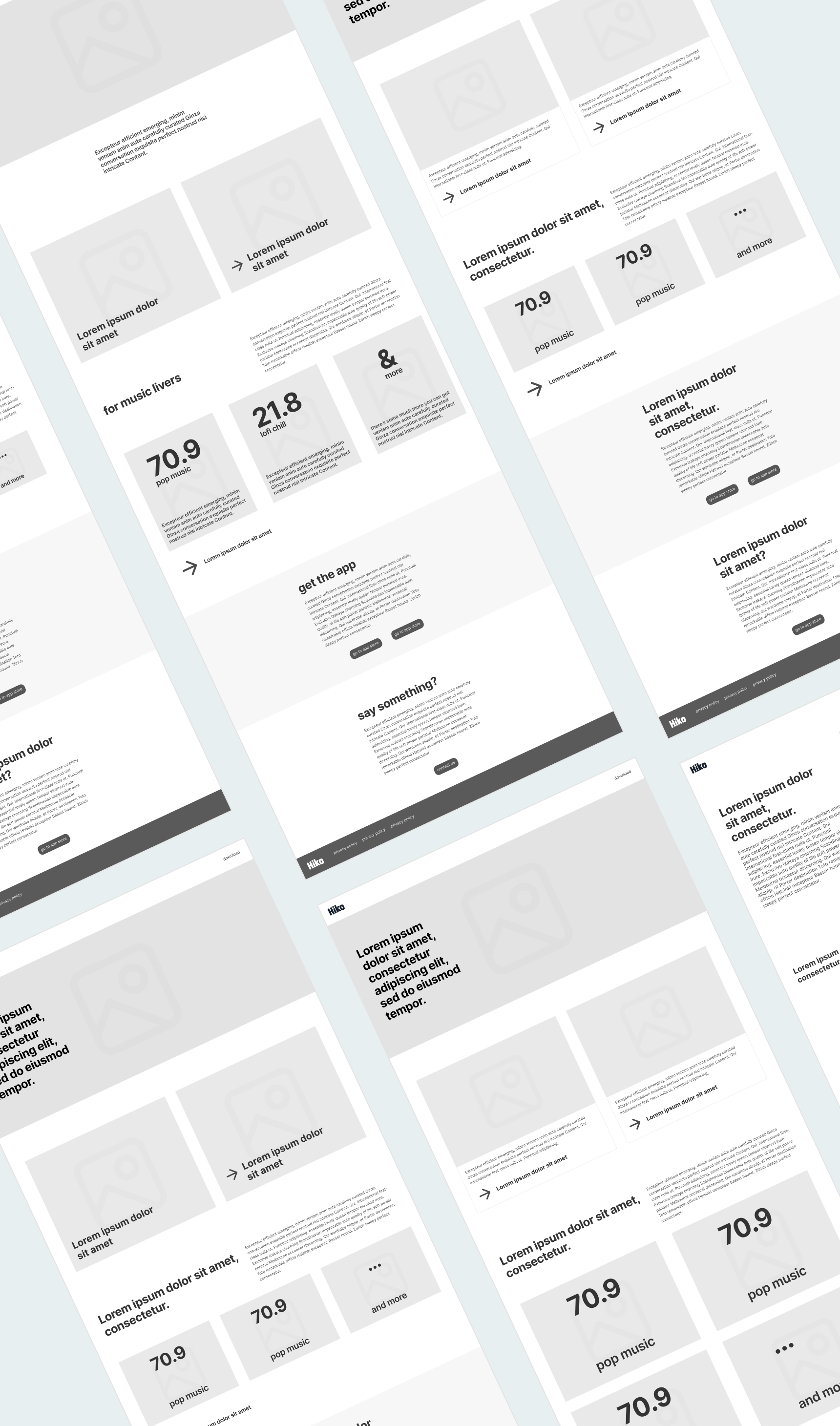
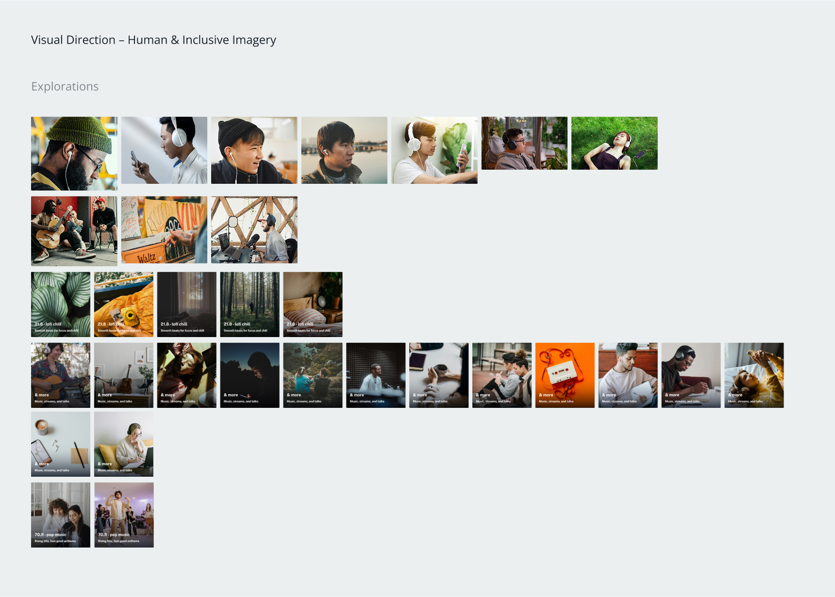
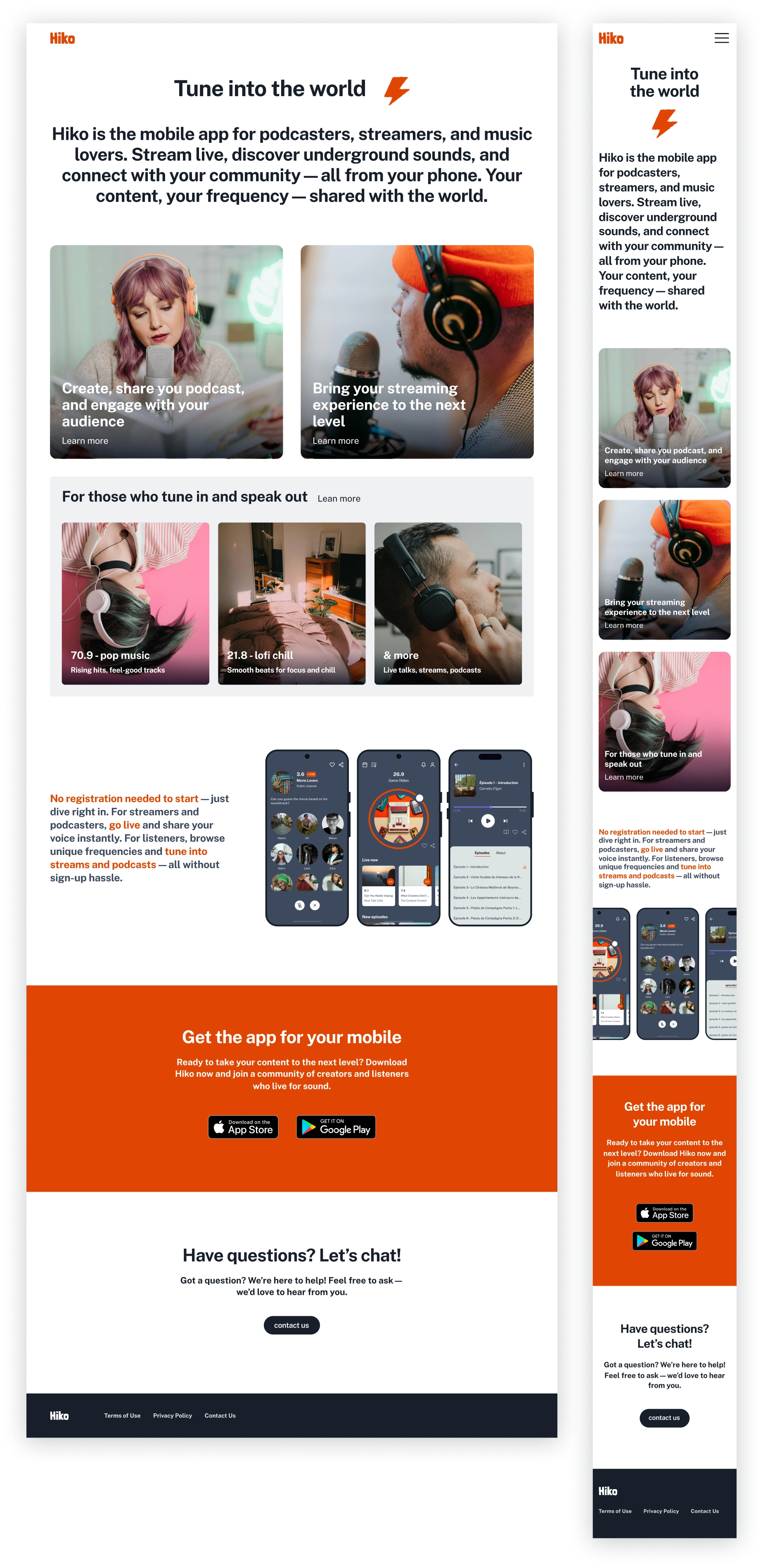
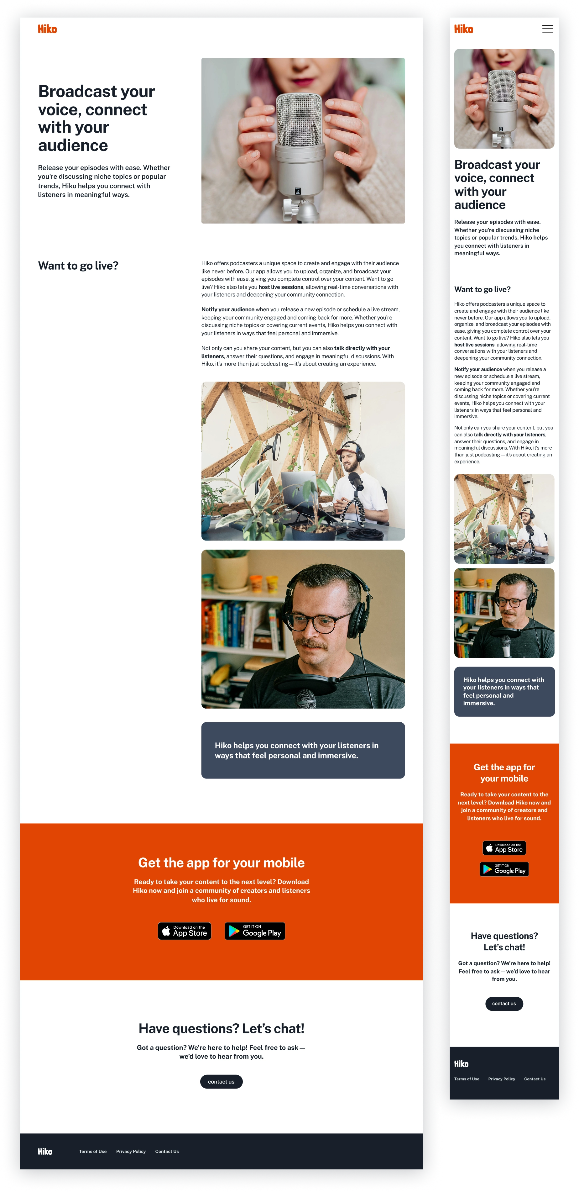
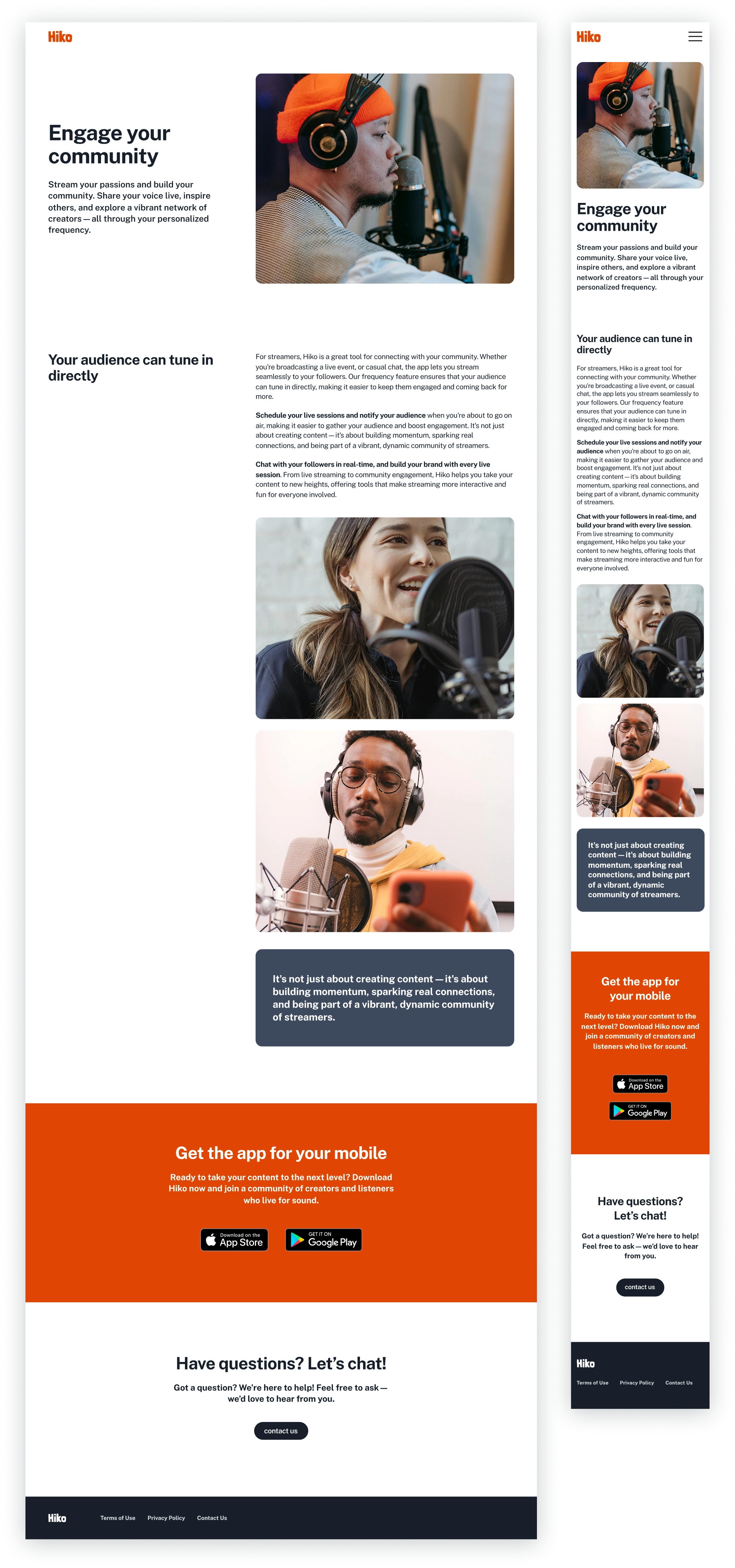
In the ideation phase, I restructured the website around a clear flow—value (landing page) → function (podcaster/streamer) → storytelling (listener)—while developing wireframes with progressive disclosure to avoid overwhelming users, refining CTAs, and typography for clarity, and in parallel evolving the brand identity through a new logo and color system to strengthen emotional connection and consistency.
I aimed for a tone that balances emotional connection with functional communication, making the experience feel honest, grounded, and close to people.
Experiments & Testing
I validated core flows through 2 rounds of guerrilla usability testing with mid-fidelity mockups in real-world open spaces (cafés and library common areas).
Usability Testing Insights
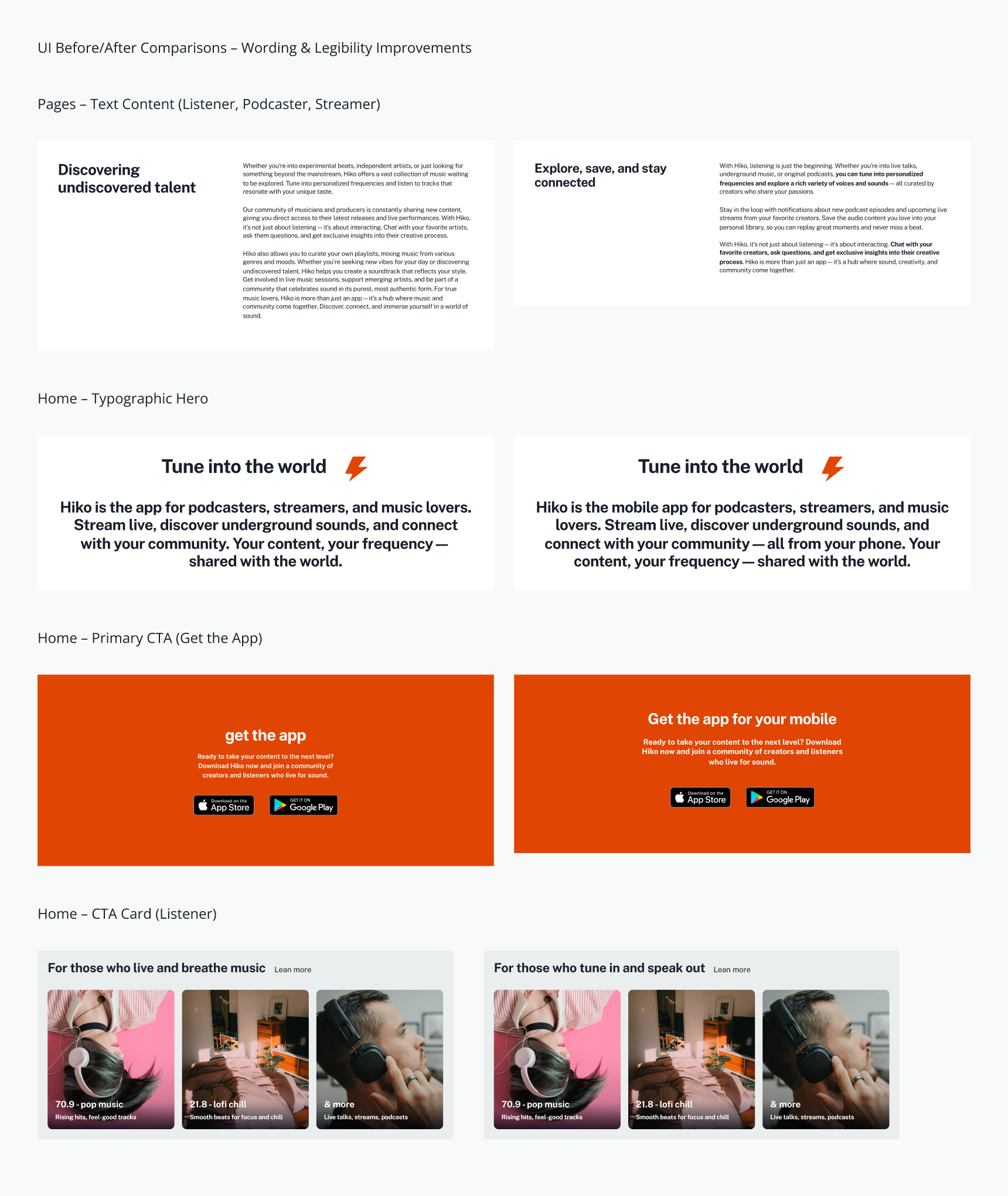
- Scanning over reading: Users skim headlines first and often skip dense text, especially on mobile.
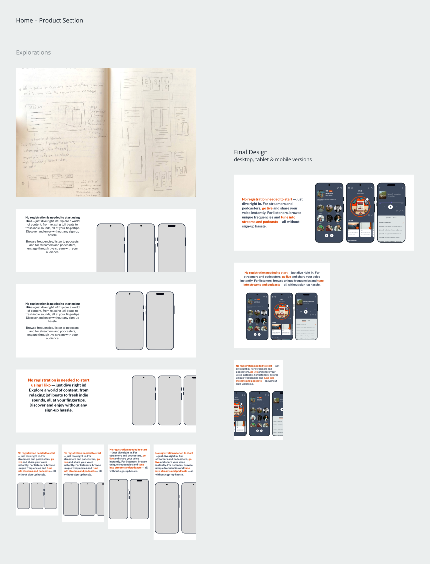
- Missing UI previews lowered trust: Seeing the product before download was critical for most listeners.
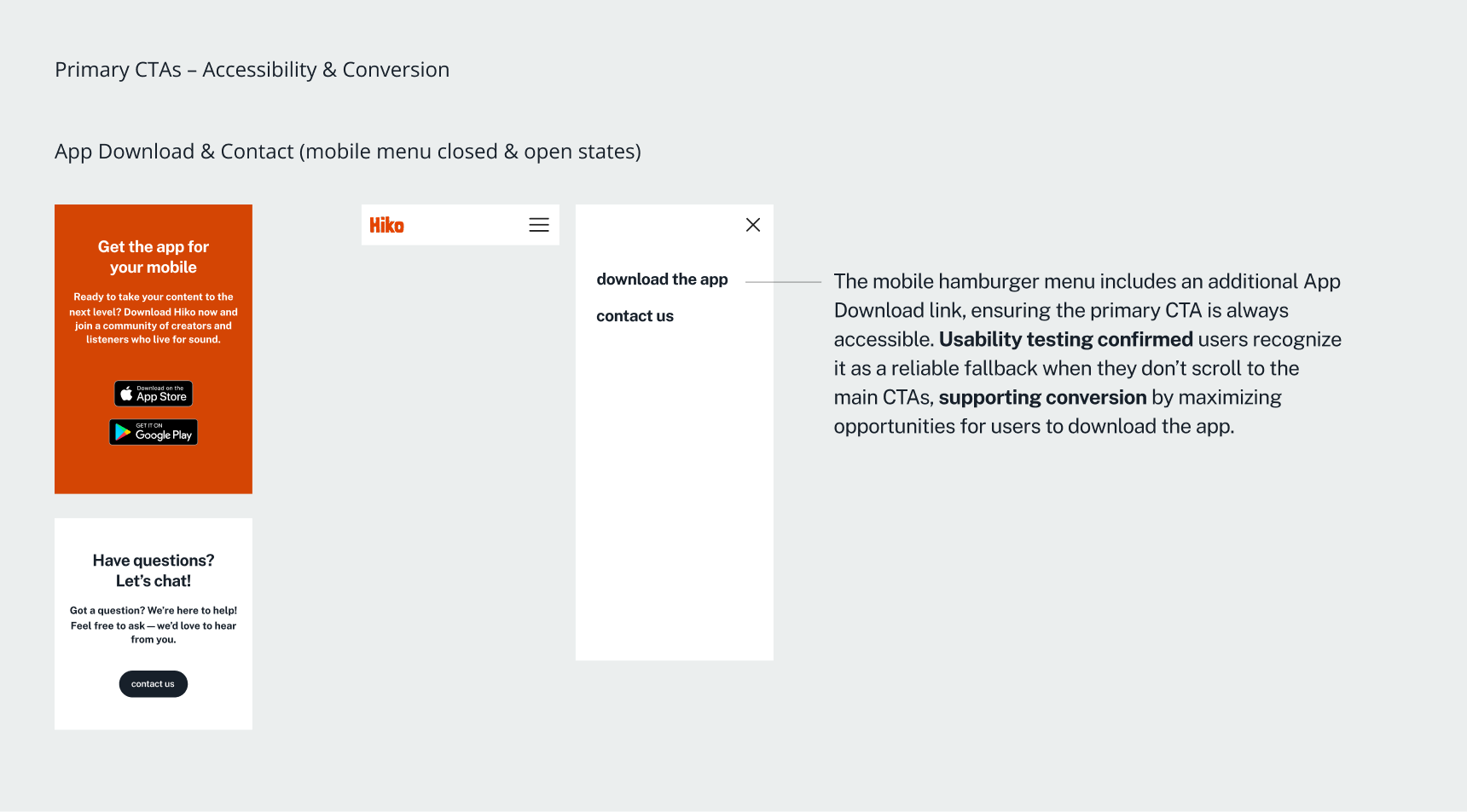
- Weak primary App Download CTA visibility: Download calls-to-action were missed when buried or off-screen.
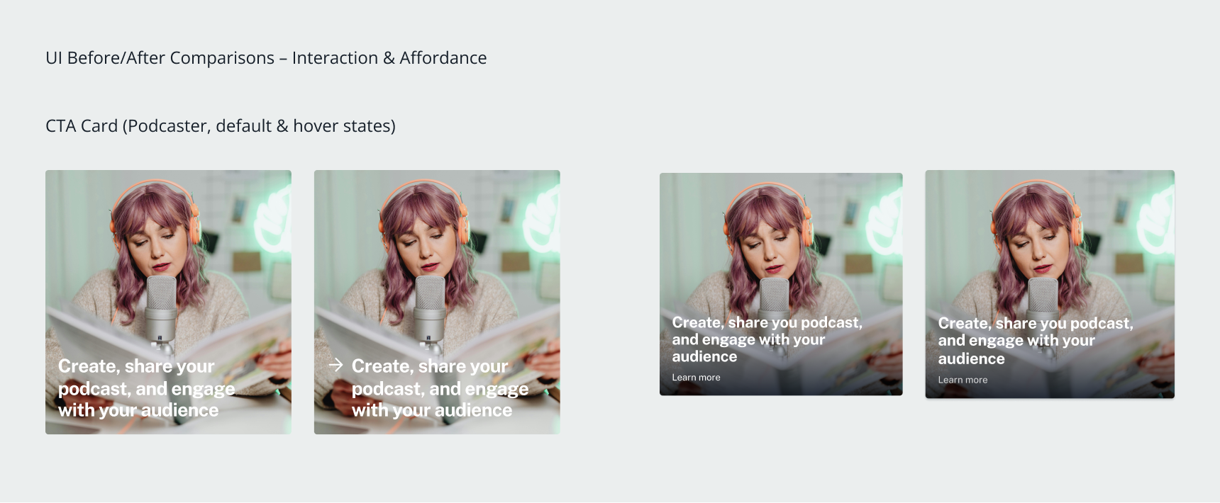
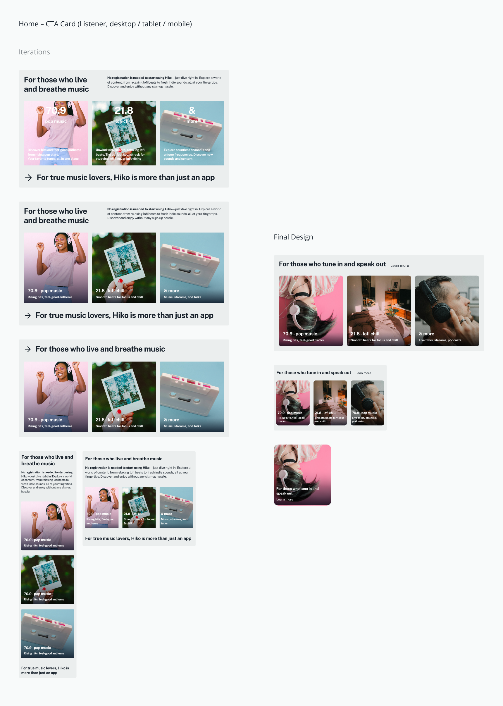
- Low affordance of CTAs cards: Creator/listener CTA cards were mistaken as static on mobile due to poor visual cues and animations.
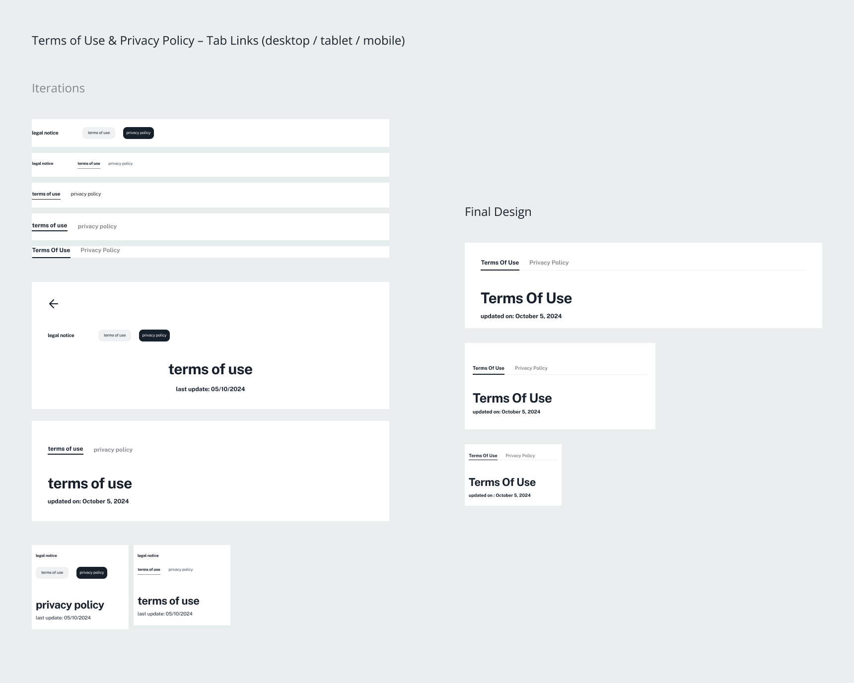
Testing revealed that the website needed more intentional attention guidance — headlines and body text had to enable quick scanning, app's UI previews were essential to build trust, and calls-to-action required stronger visibility and affordance to prevent being missed or mistaken for static content.
Refinement After Testing
Based on testing insights, I refined the UI by adjusting primary CTAs’ spacing and text to reduce hesitation, adding a product preview section to capture attention, simplifying card CTAs’ affordance and animations to lower cognitive load, and optimizing font size and text formatting across all breakpoints and orientations for better readability and accessibility.
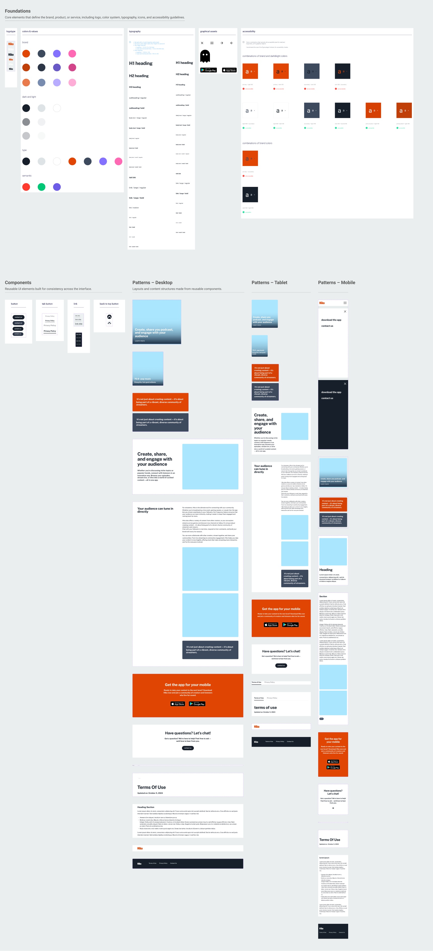
Design System
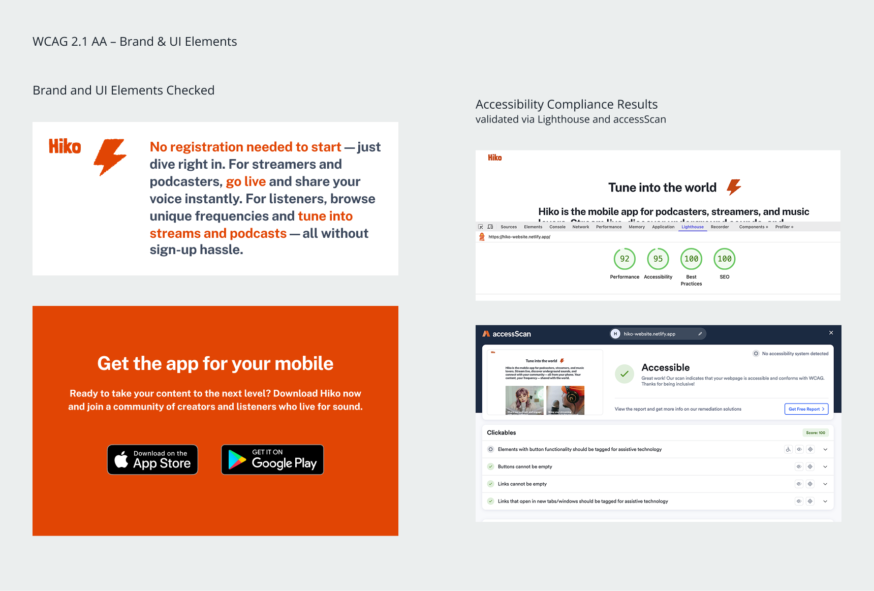
I built a Figma-based design system including brand tokens, typographic scales, reusable components with variants, responsive layout patterns, and accessibility checks to streamline design and ensure consistency across the website.
Outcome
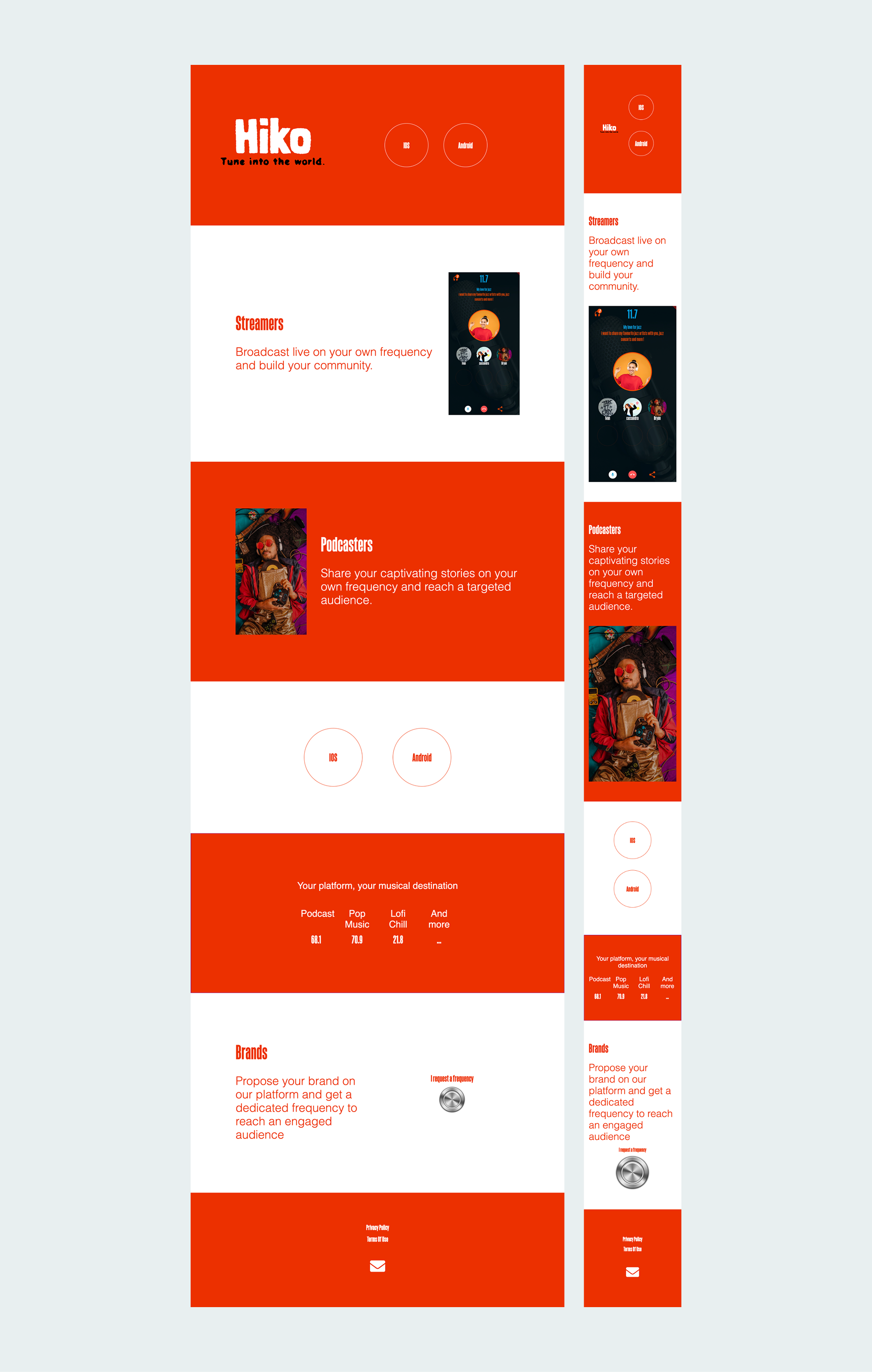
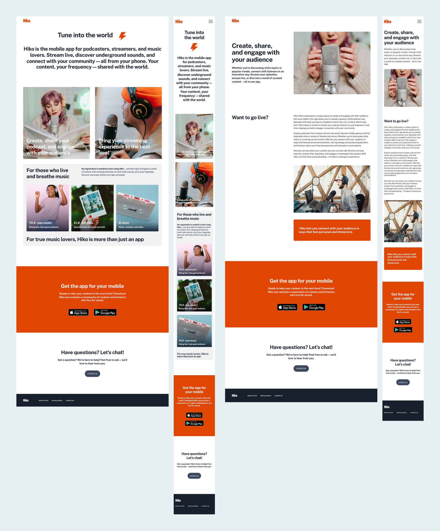
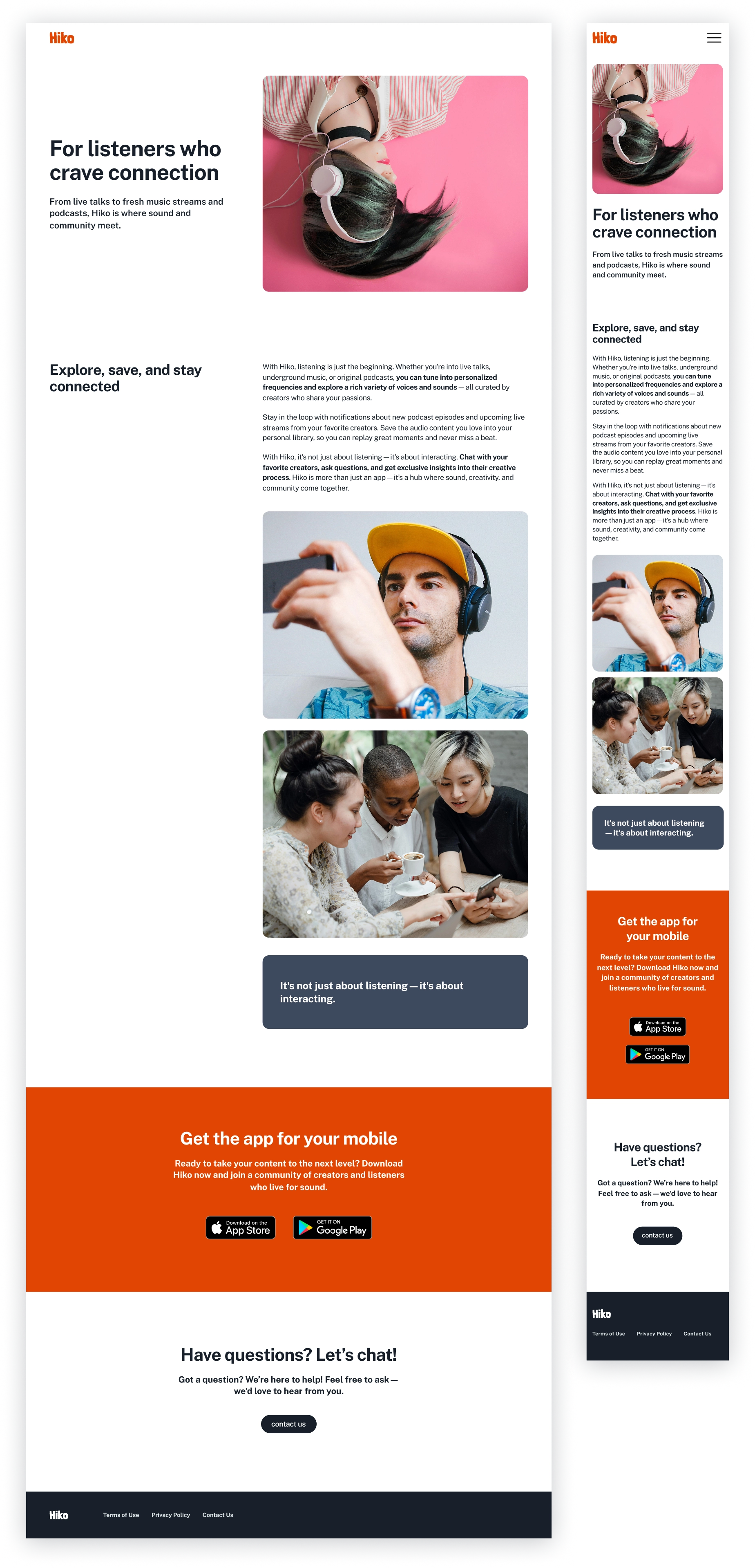
The result is a responsive website, designed and tested across desktop, tablet, and mobile, that no longer hides the value of Hiko but surfaces it — clearly, confidently, and cohesively. Alongside the website, a complete visual identity was delivered, including logo, color, typography, imagery, and tone guidelines, reflecting the app’s spirit while improving accessibility, clarity, and storytelling.
- Mobile-first SPA: prioritizes usability and emotional clarity.
- Story-driven flow: “what → how → why” for listeners and creators.
- Consistent CTAs: clear, visible, and effective across devices.
- Simplified components: UI supports content without distraction.
- Interface showcase: product preview screens highlight ease-of-use and functionality.

Following the design phase, I built the website as a responsive React SPA (React, JavaScript, HTML, CSS), tested across desktop, tablet, and mobile devices for usability, performance, and WCAG AA accessibility compliance.
view here: Hiko Website – Live Preview
Conclusion
By prioritizing clarity, simple interactions, and real user feedback through iterative testing, the redesigned website delivers a more intuitive and trustworthy experience. The website supports key goals: encouraging users to download the app (macro goal), helping users recognize the brand through a consistent identity, understand the product, and engage with app store CTAs (micro goals).
The brand design evolved from core essentials—logo and color system—toward a complete visual identity, including typography, imagery direction, and tone/voice guidelines, reflecting an iterative, research-driven process.