Intro
Role: Web & UX/UI designer
Duration: 5 years
Team setup: Worked with Product Managers, Developers, Content
& Marketing Teams, Designers, Accessibility Expert, Employer
Branding strategist, Copywriter, and Stakeholders
Markets served: Global (US & Europe); localized campaigns
(e.g., France)
Scope of work: designed solutions for internal SaaS tools, external-facing employer brand and campaign sites, marketing landing pages, premium template redesigns, and job ads—adapting deliverables for both US and EU markets.
Key Outcomes at a Glance
-
Improved project managers and sales workflows through clearer
UX/UI
in internal tools
- Sales team reported quicker access to key information
- Project managers reported increased confidence in managing their workflows with a dedicated solution
- Stakeholders appreciated the clarity and reduced need for training
- Delivered brand-consistent landing pages for external audiences
- Streamlined design workflow by redesigning internal UI materials
- Adapted assets and flows for both US and EU markets
- Effective across-departments collaborated
Process Highlights
Most projects unfolded in three main phases:
1. Discovery & Alignment
I worked closely with cross-functional teams to align on goals, reviewing marketing briefs and running ideation workshops to surface user pain points and opportunities.
2. Design & Prototyping
I designed internal tools from early wireframes to final delivery—implementing V1 and supporting V2 of the sales tool, focusing on navigation, filtering, and surfacing key information, and emphasizing intuitive interactions in the PM tool to minimize user training. I also designed branded templates for external sites and prototyped key flows (e.g., internal tools, employer brandings), with a focus on hierarchy, responsiveness, and consistency across design systems.
3. Testing & Iteration
Clickable prototypes facilitated feedback integration, which I used in sprints to refine solutions alongside stakeholders, accessibility, content, and development teams. Iterations happened primarily in Figma, with regular design critiques and developer handoffs ensuring smooth implementation.
Project Snapshots
Selected web projects demonstrating product strategy, UX/UI design, and interface implementation. I approach web design with a strict UX focus – ensuring every interface aligns with usability heuristics and business goals, even when the brief stops at visuals.
Internal Tools
I led UX/UI design on two end-to-end internal tool projects for sales representatives and project managers. The goal was to improve access to key data, streamline workflows, and enhance the employee experience. Due to confidentiality, I can’t share full screens—but I can outline the process and impact.
Research & Ideation
- Conducted stakeholders and employees interviews to uncover workflow pain points
- Participated to ideation session and gathered user needs
- Mapped user journeys and created low-fidelity wireframes to explore solutions
Design & Collaboration
- Iterated on wireframes and prototypes, integrating feedback and addressing technical limitations
- Ran design workshops with design team to define priorities, clarify requirements and create features that address users needs
- Maintained weekly syncs with stakeholders to update on my progress, communicating design decisions, seeking feedback, ensuring alignment with overall product strategy
- Maintained weekly syncs with Dev team to ensure feasibility and consistency, offering solutions to roadblocks
- Compliance with the Monster Design System
- Delivered high-fidelity UI with clear system logic for dev handoff
Cross-Functional Work
- Leading the Sales project, overseeing both the design and frontend development teams while reporting to the project manager.
- Collaborated with sales representatives, PMs, design team, dev team, and stakeholders
- Navigated shifting priorities, offering flexible UX solutions within scope
Outcomes
- Improved tool usability through better information hierarchy, layout, interaction design
- Reduced time needed to access key information and generate solutions


Reflection
These projects deepened my experience designing internal tools and working across teams in a fast-moving environment. They also strengthened my ability to adapt UX to technical and organizational constraints.
Monster France: Audio Campaign Hub (2020)
Role: Web designer & Front-End Developer | Contribution: designed the page with the marketing team through feedback rounds, then fully implemented the approved responsive design in front-end code.
Context
In September 2020, as France emerged from lockdown,
job searches on Monster.fr rose 50% a month on average (May to
August 2020 vs 2019) and daily job listings reached 90,000 by
September (vs 65,000 in June).
Against this backdrop, Monster launched a two-month
audio brand awareness campaign, announced at
30 million contacts, to raise its visibility among 20-35
year-olds and reassure recruiters that it was investing in reach.
The page gave recruiters and partners (B2B) a
single destination to discover the campaign and hear the spots.
A visible candidate audience supports Monster's value to employers, so
the page also linked the campaign to its recruiter offering.
The brief
Create a campaign hub page on monster.fr, for desktop and
mobile, presenting the campaign (when, where, for whom) and provide
access to its two audio spots.
Design strategy
- Information architecture: Prioritised the information in the order a visitor ask it: what is this, where does it run, how do i hear it.
- Media mix at a glance: Used the streaming and podcast platform logos (Spotify, Deezer, SoundCloud, NRJ, Adwave, Podcasts Prisma Audio) as a quick read of the media plan.
- Clear primary action: Made the two spots the primary action, as large, clearly labelled cards, since listening is the page's main purpose.
- Brand alignment: Using Monster's design system, header and footer keep the page part of monster.fr and keep the recruiter offering within reach.
- Cross-functional collaboration: Partnered with the marketing team to explore several design directions (page layout and flow, photographic vs. graphic hero, neutral vs. colour-block sections) and aligning on the cleaner, more consistent version.

Delivery
Designed for desktop and mobile, the page was implemented in the
front-end as the single destination for the campaign. Analytics
tracking was integrated into the audio spot links so engagement
could be measured.

Monster France: Testimonials Landing Page (2020)
Role: Web designer (UX analysis and UI design) | Contribution: Audited the existing page against UX heuristics, redesigned it with the marketing team through feedback rounds, and worked with a developer through implementation.
Context
Designed in September 2020, the page targeted recruiters and employers
in a market where Monster competes with LinkedIn and Indeed. It had
two goals: generate leads, and drive purchase confidence by leveraging
peer testimonials to build trust. Ultimately, the page aimed to
support the sales team during the late stages of the funnel –
alleviating lingering clients' doubts and accelerating the transition
from quote to final purchase.
The problem
Hiring is a high-pressure decision for Monster's clients, where slow
cycles delay projects and prolonged interview rounds force
compromises. Because choosing a hiring platform to solve this is a
high-stakes financial investment, late-stage prospects can easily
hesitate over the perceived risk of a low-return decision.
This creates a critical bottleneck at the end of the funnel, where the
sales team requires targeted tools to address lingering client doubts
and turn open quotes into final purchases.
To address this late-funnel challenge, the project objective was to redesign the existing testimonial page to mitigate perceived buying risk. By leveraging peer success stories, the design needed to alleviate client doubt, build immediate trust, and help move the transaction from quote to purchase.

The brief
Redesign the existing "Success stories" page on monster.fr, for
desktop and mobile, so it aligns with the Monster design system and
works as a sales support tool, with testimonials organized by product.
The brief went no further, so i turned it into a diagnosis:
audit the page against UX heuristics, flag the issues, and address
each with a design solution.
Design strategy
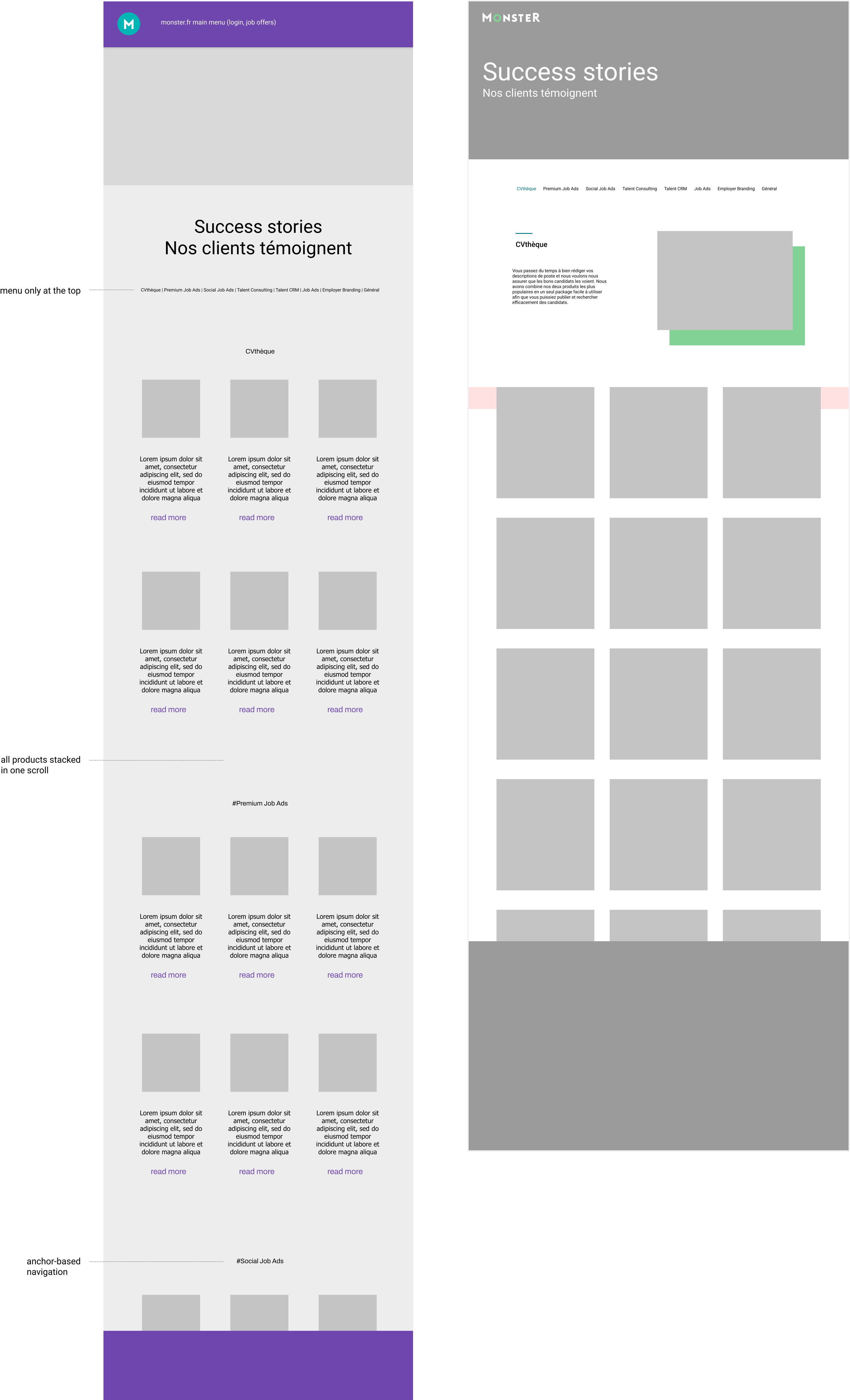
The original page was visually disconnected from Monster's brand and
tricky to use. It relied on page anchors: the product menu sat right
after the header and wasn't fixed, so switching product meant
scrolling back to top. It also displayed every testimonial of every
product at once, resulting in a very long page.
- Consistency and Standards: rebuilt the page on the Monster design system (internal consistency) and replaced anchors with a familiar filter pattern (external consistency). Users select a product and see only its testimonials.
- Recognition Rather than Recall: a fixed menu keeps all products visible, so users never have to remember them or scroll back.
- Visibility of Stystem Status: the selected item is highlighted in Monster's brand green, and the section title updates (e.g. "CVthèque" to "Job Ads"), so users always know what they're viewing.
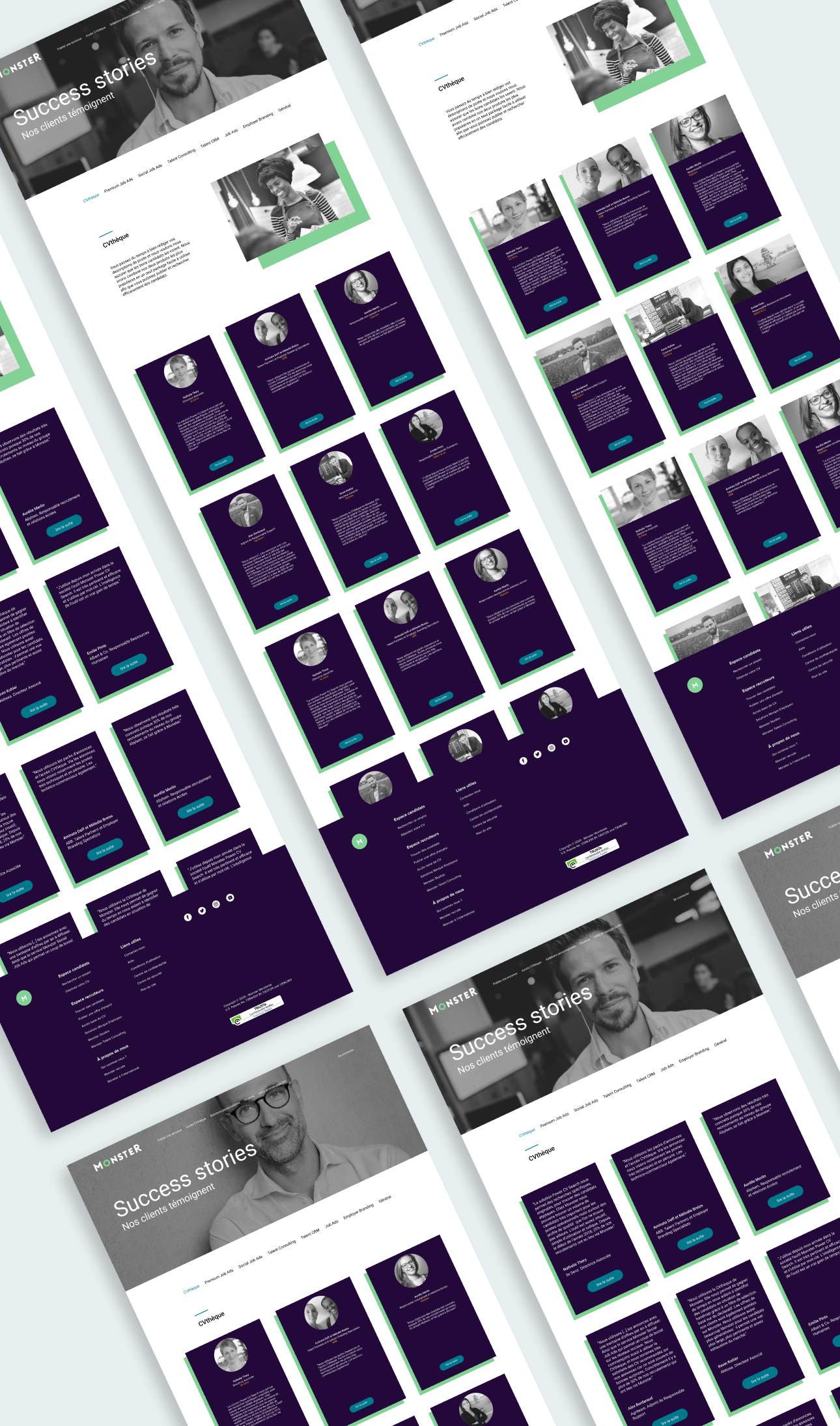
- People first: following the style guide, which celebrates the individuals behind employers and candidates, cards lead with a named, black-and-white portrait, role and company. The words are credible and field-grounded, so employers find them relevant to their own challenges.
- Trade-off: while logos offer instand brand recognition on testimonial cards, a truly people-first design prioritizes human faces. I replaced them with company names to anchor the focus entirely on real customer stories – the page's core value.

I also explored a short product intro above each category to give the testimonials context, dropped during feedback rounds.
Delivery
A responsive page grounded in the Monster design system, with
people-first cards, navigation always at hand, and filtering that
shows only the testimonials for the products users care about, instead
of making them scroll through evry story at once. A back-to-top button
keeps monster.fr's main menu (login, products) one tap away.
Responsive testing across desktop and mobile was conducted
alongside the developer prior to release.
How it works: a sticky filter menu sits right after the header, with CVthèque selected by default. Selecting another product, such as Job ads, updates the section title, hides the previous category, and shows only that product's testimonials, starting from the first card. Cards expand with "lire la suite" to reveal the full story.

Conclusion
Throughout these projects, i consistently applied a user-centered design process—starting with stakeholder collaboration and research, moving through iterative prototyping and validation, and working closely with developers to ensure quality implementation. By aligning design decisions with brand guidelines and strategic business goals, i contributed to creating thoughtful, user-focused solutions designed to meet both user needs and business objectives.
What i've learned
Working across teams and time zones sharpened my ability to design in fast-paced, multi-stakeholder environments.